What do I mean by “website development”?
Brief definition:
Website development refers to the entire process of planning, structuring, designing, and technically implementing a new website.
It covers every step, from the initial idea to the finished page.
So you could say:
Professional web design = a well-thought-out website structure.
The basic structure of a website: header, body, footer
Before we delve deeper into the overall website structure, it’s worth taking a look at the basic layout of each individual page.
Every webpage, whether it's the homepage or a subpage, follows certain proven layout principles that have stood the test of time.
These structures are essential for a user-friendly and effective website.
This basic structure helps visitors find their way around, as they can find key elements exactly where they expect them to be.
A typical page consists of three main sections:
- Header (the top section of the website)
- Body (main content of the page)
- Footer (Fusszeile der Website)
Imagine your website as a house.
The header is like the entrance area or foyer, the body is the actual living room or study, and the footer wraps things up with additional information.
Each of these areas serves a specific purpose.
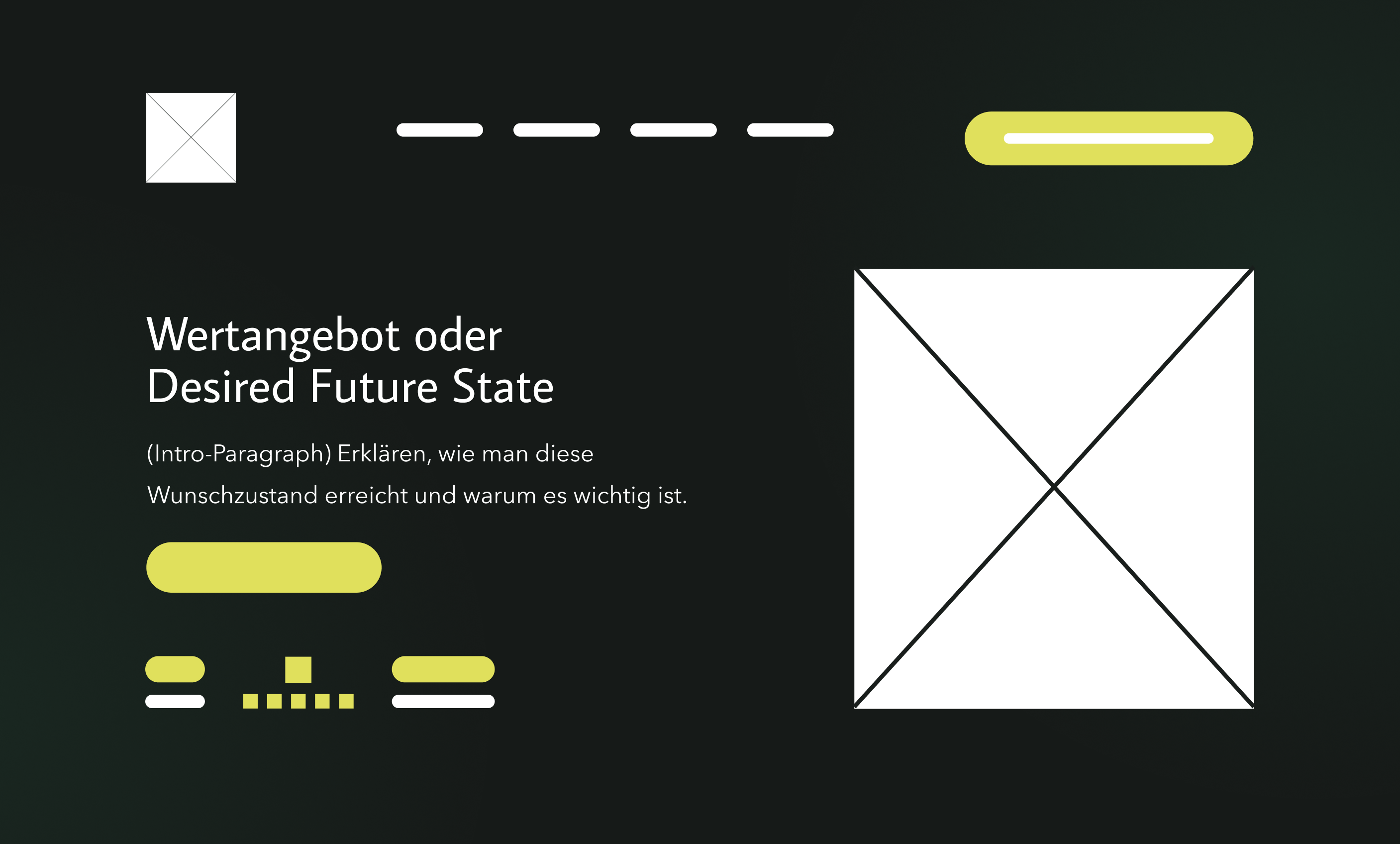
Header: the top section of each page
The header contains the website's logo and main navigation.
You'll often see a so-called top bar (also known as the navigation bar) at the top, which contains the website's most important subpages.
Visitors should be able to find their way around immediately when they see the header.
As soon as someone visits your site, they should immediately be able to tell from the header where they are on the website (based on the logo and page title) and what the main menu contains.
Zudem sollte ein guter Header einen Haupttitel (H1-Titel) beinhalten, in dem das Wertangebot klar kommuniziert wird.
Zudem sind die Integration eines kurzen Einführungsparagrafen und ein Call-to-Action (CTA) empfehlenswert.
Im Einführungsparagraf sollte in 1–2 Sätzen erläutert werden, wie man das Wertangebot realisiert.
The CTA should highlight the action the user is supposed to take on the page.
It is important to note that:
The header should not be cluttered.
It should provide guidance and grab users' attention right away, but without overwhelming them with too many options.
For navigation, 7–8 menu items is ideal.
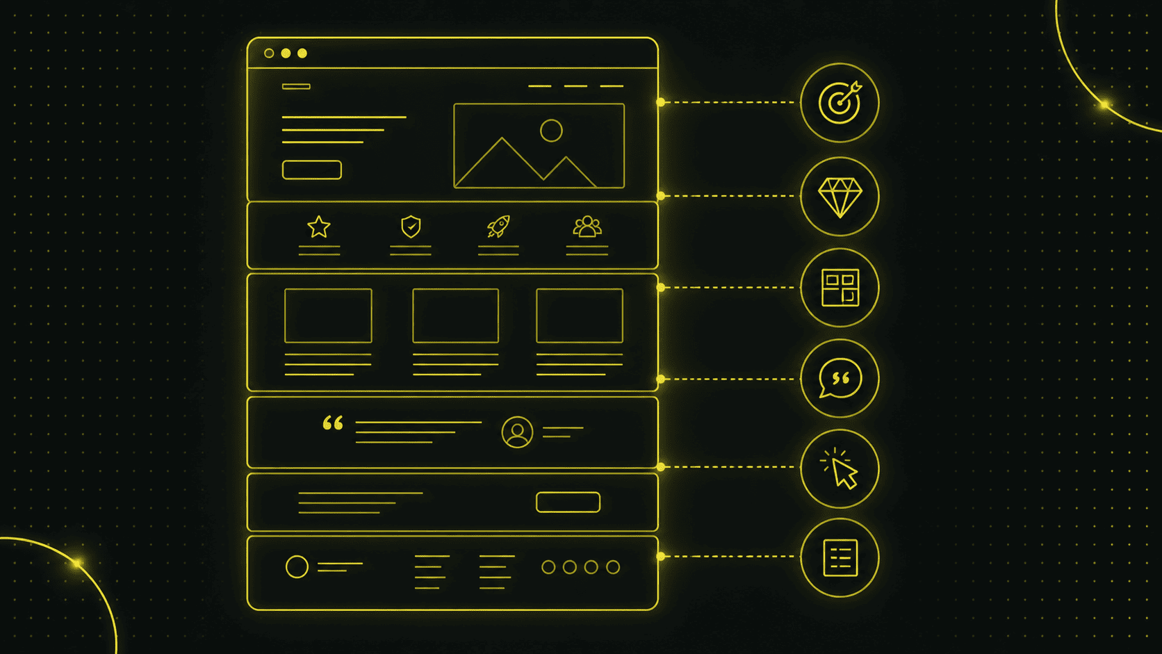
Body: the core content
The body section begins below the header.
Während der Header die Hauptfunktion hat, ein klares Wertangebot zu positionieren und Neugier zu wecken, geht es im Hauptteil darum, den Nutzer von seinem Angebot zu überzeugen.
This section is unique to each page and should be clearly structured so that users can easily grasp the information.
Headings and paragraphs break up the text, while images add visual interest and reinforce the message.
The following sections must be included in the body section:
Problems / Pain Points
Es sollten die Probleme und Schmerzpunkte deiner Kunden direkt auf der Website thematisiert werden, damit sich diese direkt wiedererkennen und eine Selbstselektion stattfindet.
Solutions / Benefits
To address these pain points, you need to provide your target audience with a solution to their problems.
Dabei stellst du dich, dein Produkt oder deine Dienstleistung ins Zentrum.
Social Proof
To gain people's trust online, you need reviews or testimonials that show your product or service has already helped others.
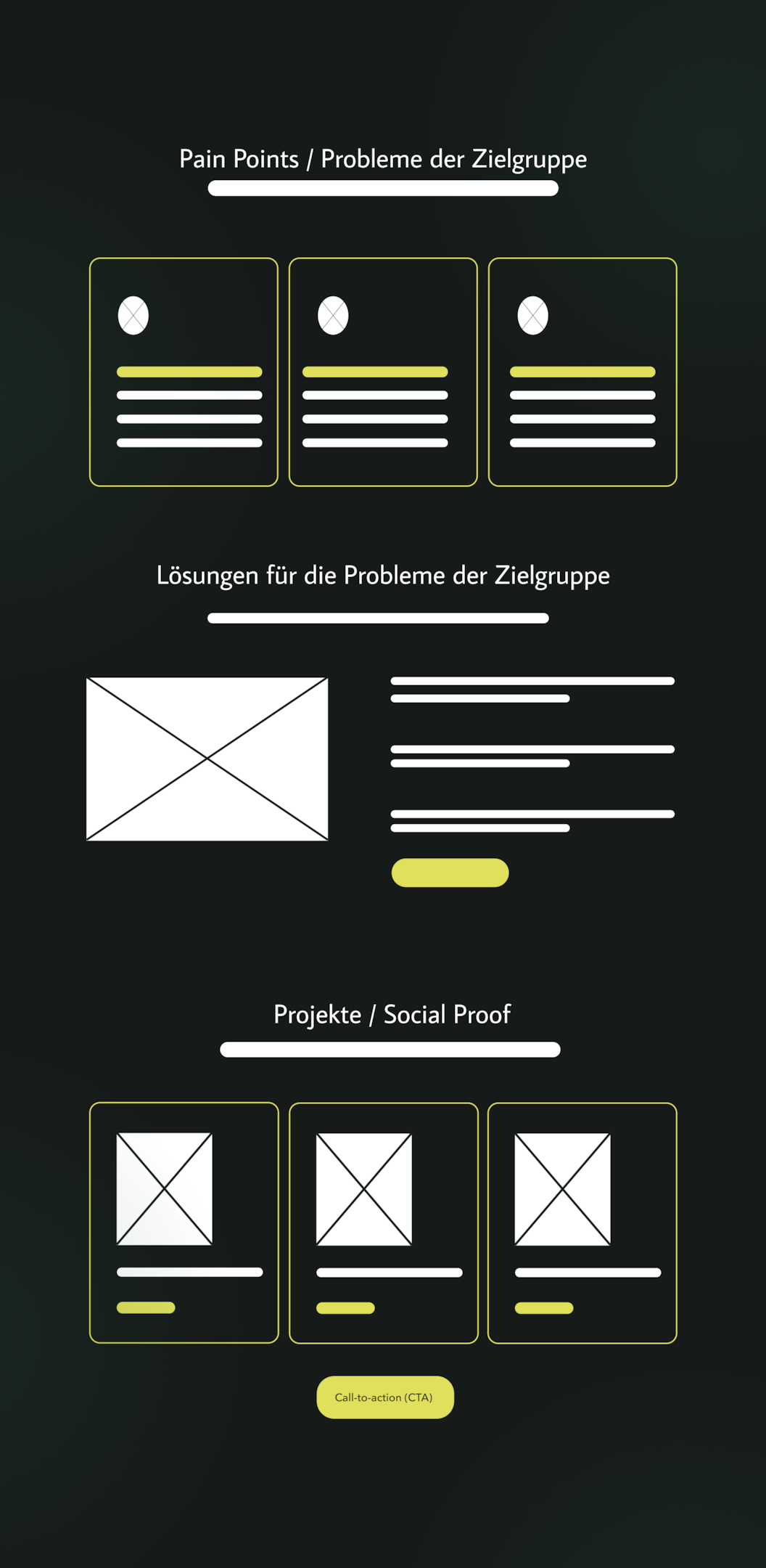
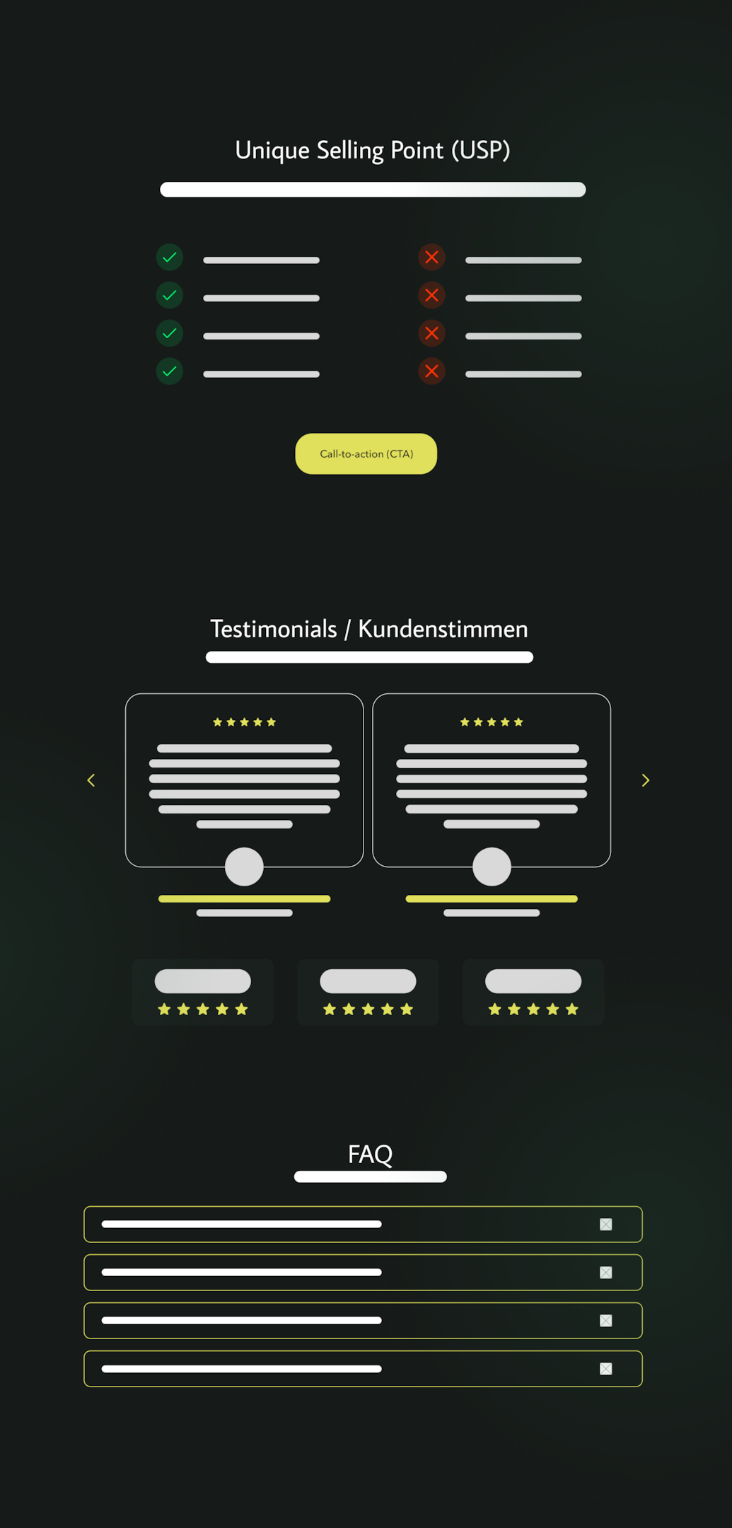
Unique Selling Proposition (USP)
It's not enough to simply present your offer.
Du musst auch aufzeigen, warum die Menschen gerade bei dir einkaufen sollen.
Testimonials / Customer Reviews
One of the best ways to convince your target audience is through other people who have already had positive experiences with your product or service.
FAQ / Frequently Asked Questions
Include an FAQ section to address potential questions and objections from your users.
If appropriate, videos, lists, quotes, or tables may also be included here, depending on what works best for the content.
Bei komplexeren Funktionen wie z. B. einem Produktfilter oder einer Bildergalerie ist der Body der Platz, wo diese erscheinen.
On blogs, you usually see a list of posts in the body of an overview page.
Important:
The content should always be tailored to the page's objective.
Wenn die Seite z. B. ein Service-Angebot vorstellt, endet der Body vielleicht mit einem Call to Action („Jetzt Angebot anfordern“) nach der Beschreibung.
Example – Structuring the body:
First, describe your offer, and then include a button that says “Free 30-minute consultation.”
This is how visitors are guided through the exhibition.
The body of the text can also be made clearer by using subheadings or visual separators.
Some websites also use a sidebar next to the main content area to display additional content or navigation options, such as the latest blog posts, a small menu, or a newsletter sign-up form.
However, a sidebar is optional and should only be used if it serves the purpose of the page.
(The sidebar is not a required element and can look different on each page as needed.)
Footer: the bottom of each page
If you scroll all the way to the bottom, you'll see the footer.
This section is also consistently visible on all main and subpages.
This section often contains additional information and links that, while important, are not essential for all visitors.
Typische Inhalte im Footer sind z. B. Kontaktadresse, Öffnungszeiten, ein Copyright-Hinweis und Links zu Rechtlichem (Impressum, Datenschutz).
Gerade in der Schweiz und im DACH-Raum sind Impressum und Datenschutzerklärung Pflichtangaben.
Social media links or a newsletter sign-up form can also be included here.
Viele Firmen listen im Footer zudem noch einmal die wichtigsten Seiten auf (z. B. erneut die Menüpunkte der Hauptnavigation oder zusätzliche Seiten wie „Jobs“, „Presse“ etc.).
The footer is where a user ends up once they have finished browsing the main content of the website.
Here you can offer him some helpful links again or make it easier for him to get in touch.
A clean, well-designed footer completes the layout of your website.
Below is an example of a multi-column website footer:
On the left is a navigation bar (here: Methods), in the middle are additional topics, and on the right are contact information and legal links.
The footer appears consistently at the bottom of every page.
In summary
Every subpage of your website has this basic structure consisting of a header, body, and footer.
If you stick to this, users will immediately feel "at home" because it meets their expectations.
The navigation should go at the top, the main content in the middle of the page, and secondary elements at the bottom in the footer.
This framework will help you find your bearings.
Doch ein erfolgreicher Webseitenaufbau geht weiter, wie ich in den folgenden Abschnitten weiter ausführen werde.
Hierarchy, Navigation, and Internal Links
Once the general structure of a page is clear, the bigger question arises:
What are the main components of a website?
In other words:
How do I organize all these different pages and pieces of content in a logical way?
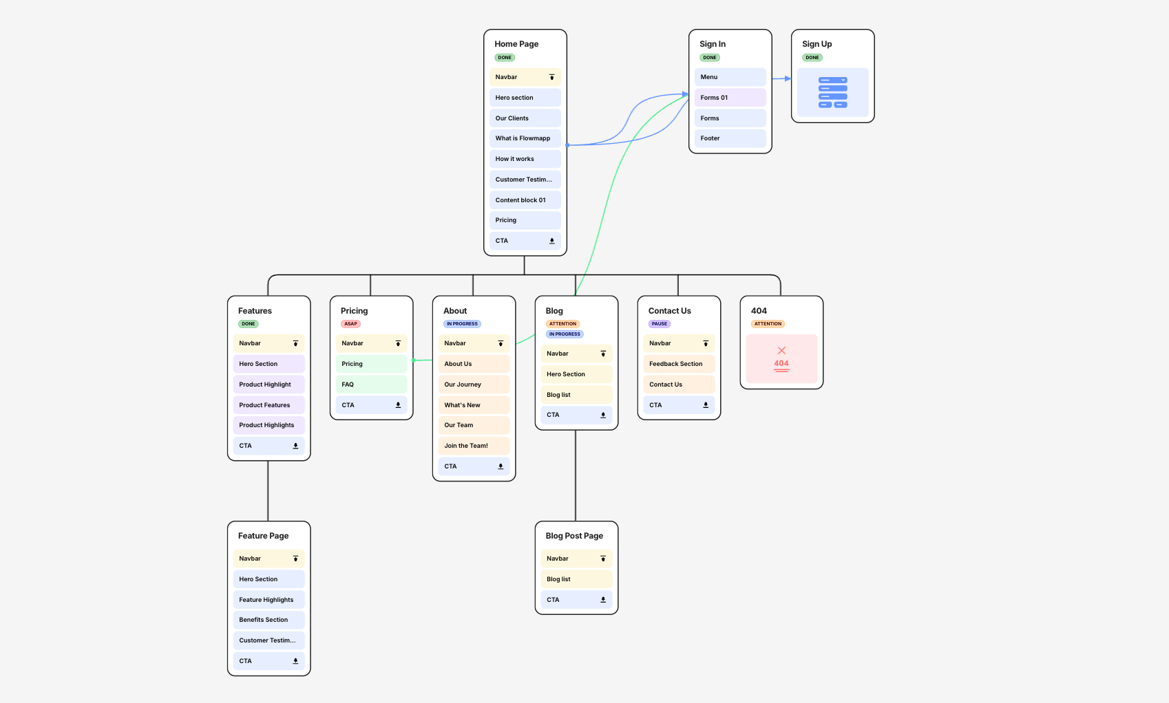
The structure of a website refers to the arrangement of all pages within the navigation menu and the internal links connecting them.
Als Webdesigner ist es meine Aufgabe, diese Webseitenstruktur sorgfältig zu planen, bevor die erste Seite gebaut wird.
Imagine a website as a tree diagram.
The homepage (home page) is at the top.
The main categories are listed below.
These are the items you see in the main navigation menu, such as “About Us,” “Services,” “Testimonials,” and “Contact.”
These main sections may in turn have subpages:
For example, individual service pages under “Services,” individual project reports under “References,” etc.
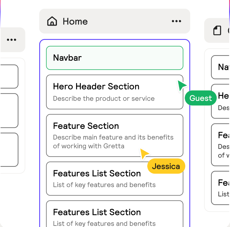
Für die Erstellung der Hauptnavigation und der jeweiligen Unterseiten empfehle ich ein Tool wie Relume.
The hierarchy should be as flat and clear as possible.
The click depth should not exceed 3 clicks.
One example:
A typical website structure for a service company might look like this:
- Home Page: Welcome message, overview of key features with links to subpages.
- Über uns: Informationen zur Firma, Team, Firmengeschichte.
- Services: Overview of all services.
- Service A (Details Page)
- Service B (Details page)
- Service C (Details page)
- References: Client projects or case studies.
- Project 1 (Details page)
- Project 2 (Details page)
- Blog/News: Latest articles or news.
- Post 1
- Post 2 (each as a separate blog post)
- Contact: Contact form, Address, Email address, Phone number
You get the idea.
The main navigation bar contains the most important categories.
Subpages are grouped by topic.
This structure makes it easy for visitors to find their way around, because related topics are grouped together.
At the same time, it helps search engines understand the content.
Google takes a close look at the website structure and internal links to determine which pages are important and how the topics are related.
A clear structure is therefore the foundation for effective SEO (search engine optimization) and a positive user experience.
Es lohnt sich, einen Blick auf die Webseitenstruktur deiner Mitbewerber zu werfen.
Analyzing competitors' website structures can provide valuable insights.
How should a website be structured so that navigation and content work together seamlessly?
So wenig Hauptmenüpunkte wie nötig
Five to seven items in the main navigation are ideal.
Too many menu items can be overwhelming and make the menu seem cluttered.
I'd rather have fewer items that cover a wide range of topics than a separate menu item for every little thing.
Don't hide important pages
Everything that is essential to your target audience should either be included directly in the main navigation or be accessible from the home page in just 1–2 clicks.
Users are impatient.
If they can't find something, they give up.
A well-designed website structure ensures that the most important information is accessible with just one click.
Plan the depth of the navigation
Überlege, ob du zweistufige Menüs (Dropdown) benötigst.
A structure with submenus is useful if you have a lot of subpages.
But here, too, the rule is: group them clearly.
For very large websites, a mega menu can be useful.
For small websites, a single level is often sufficient.
Use internal links
In addition to the menu, there should also be links within the pages.
For example, in the description of Service A, you can link to a case study in the References section, or link directly from the quote to the contact form (“Submit a Request Now”).
These internal links connect the pages in a logical way and guide both users and search engines through your content.
Make sure that every important subpage is linked to at least once somewhere; nothing should remain “hidden.”
As an SEO analysis shows, every important subpage can rank for hundreds of search terms on Google, provided the website’s structure is clearly defined.
Planning the website structure is often an iterative process.
I often start by sketching out a sitemap and discussing it with the client.
This sometimes leads to new ideas: “Do we still need an X department?” or “Can we merge Y with Z?”
It’s much easier and more cost-effective to make such changes on paper or using design software like Relume or Figma during the planning phase than to tinker with the finished website later on.
That's why I'm putting enough time into this.
This phase is also where SEO considerations come into play.
What search terms do we want people to find us by?
Have we set aside appropriate pages for this?
What does the internal linking structure look like to boost the relevance of these pages?
At this point, I might also start planning future website content and landing pages to get the website ready for them.
My extra tip:
It can also be helpful to take a look at your competitors' website structure.
This way, you can see how others in your industry structure their content and adopt best practices where appropriate.
Zusammengefasst steckt hinter einer übersichtlichen Webseitenstruktur eine Menge Denkarbeit.
A web designer is essentially a planner.
He designs the basic structure of your website, much like an architect draws up the plans for a house.
Content and Layout
Now comes the part that many consider to be the heart of web design:
Design the layout, organize the content, position elements, and select colors and fonts.
Here, the previously created structure is incorporated into an appealing visual design.
But even here, it's about more than just aesthetics.
The primary focus is on user experience and conversion.
Organize and prioritize content
Zuerst gilt es, die vorhandenen Website-Inhalte auf jeder Seite nach Wichtigkeit zu priorisieren.
What should visitors see right away, and what can be placed further down?
As a rule, the most important information comes at the very beginning, while less important facts are included in the sections that follow.
In addition, care should be taken to ensure that there is a common thread.
Each page should "read" like a little story.
Menschen lesen am Bildschirm eher flüchtig. Deshalb muss man Informationen so aufbereiten, dass sie leicht zu überfliegen sind.
Wie eine bekannte Studie von Nielsen längst belegt hat, lesen 97 % der User im Web nicht, sie scannen durch Inhalte.
A well-structured website also means that each page focuses on a single main topic.
This helps avoid distractions.
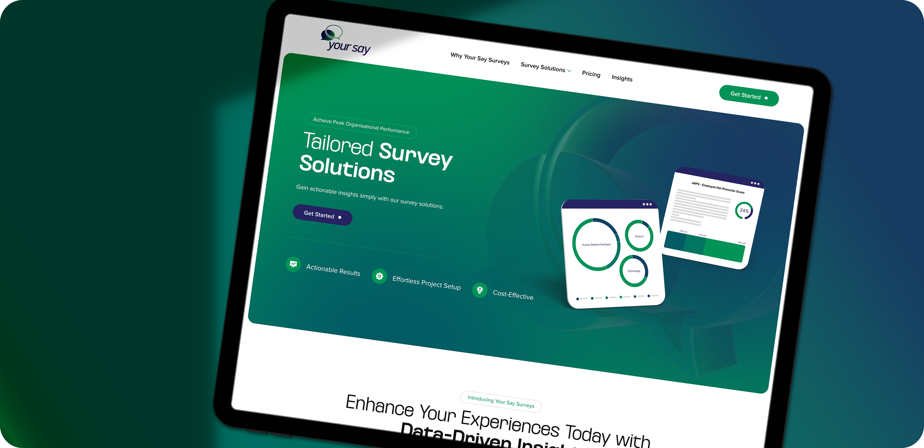
Visual Hierarchy and Layout
Good web design guides users effectively through the website.
At Beyondweb, we work with visual hierarchy.
Important elements are larger and more prominent, while less important elements are smaller or more subtle.
For example, call-to-action buttons should stand out clearly in terms of color and contrast so that they catch the eye.
Headings should be significantly larger than the body text.
Quotes or key figures can be highlighted visually.
At the same time, a consistent layout should be maintained to create a professional, cohesive impression.
Wiederkehrende Elemente wie Buttons, Icons, Bildstile, Abstände zwischen Absätzen – all das muss konsistent durchgezogen werden.
A common mistake made by amateur websites is a haphazard mix of stylistic elements.
This not only confuses the user, but often looks messy and inconsistent.
As a web designer, I therefore often create a style guide or prototypes of the most important page types in advance to ensure that the design and structure are consistent.
Hier ein Beispiel eines Styleguides, den wir vor einem Web-Relaunch erstellt haben, mit Farben, Schriften, Formen und einer Iconography.
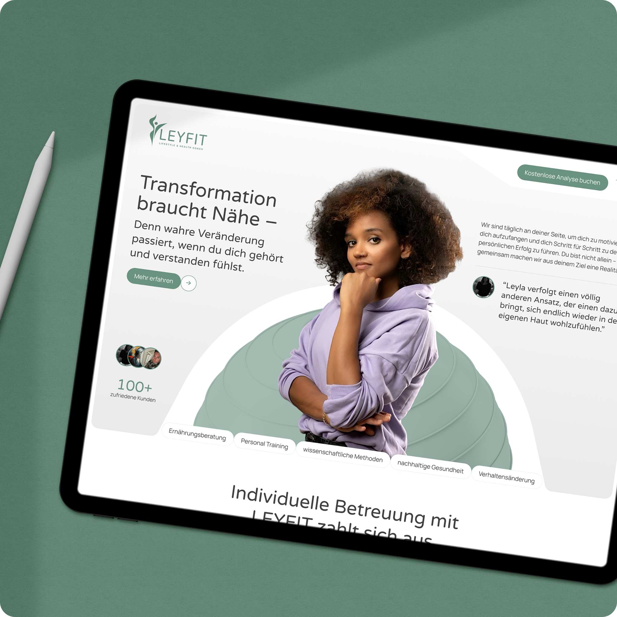
Using multimedia and images effectively
A picture is worth a thousand words.
But only if they are used appropriately.
I select images and graphics that reinforce the text's message and evoke emotions without distracting the reader.
I also optimize the file size so that the page loads quickly.
A common "aha" moment for customers:
Professional web design also involves cropping images, naming them correctly, and adding alt tags (for accessibility and SEO).
Videos can also be effective, but they must be strategically placed and technically well-integrated.
Generally, I incorporate visual elements in a way that enhances the flow of reading—for example, placing an explanatory diagram next to a descriptive paragraph, as shown in the example below.
Features and Interaction
Modern websites are often more than just static online business cards.
Maybe you'd like to generate leads.
Then I'll add a lead generation form or a clearly visible contact button.
Or maybe you want to sell products directly.
Then you'll need e-commerce features that include a checkout function.
For events, perhaps a calendar; for a restaurant, a reservation feature.
I plan to include all of these features.
It is important that they are easy to find and use.
Ein schönes Design nützt nichts, wenn z. B. das Kontaktformular irgendwo versteckt ist oder kompliziert aussieht.
That's why I place interactive elements in prominent locations and test them from the user's perspective.
Even the placement of a simple button can affect how many people click on it.
Web designers have a lot of experience with what works well in this area.
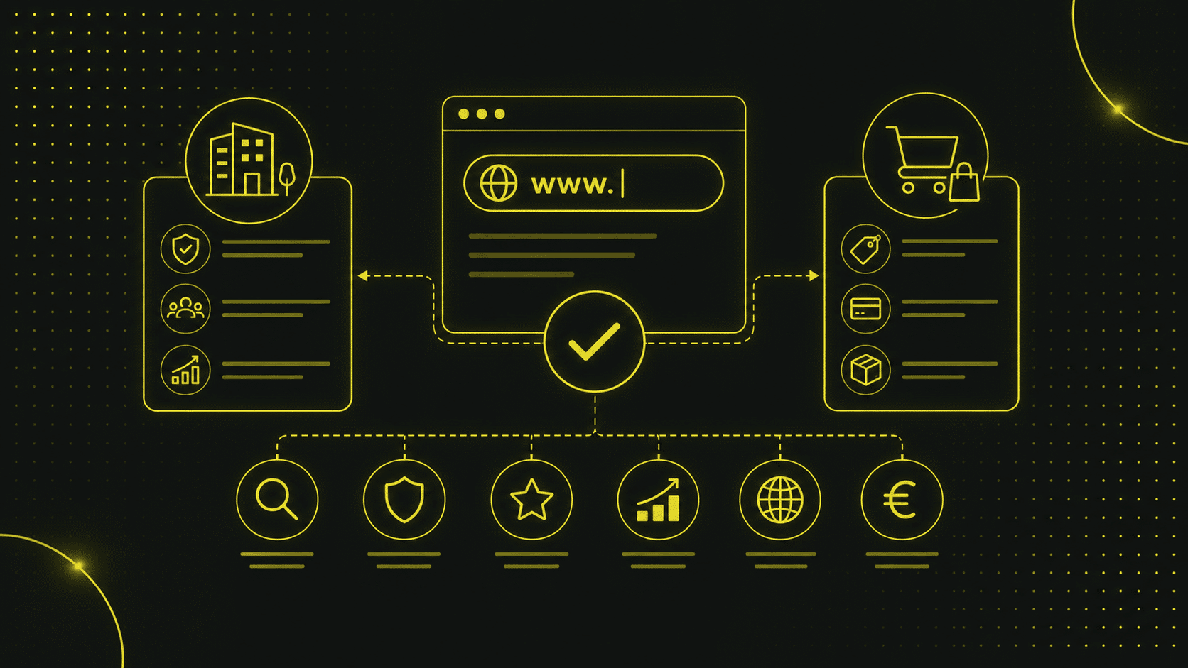
What are the technical components of a website?
Even though I don't want to bore you with technical details, a brief overview is in order.
At its core, a website consists of code (HTML for the structure, CSS for the appearance, and JavaScript for interactive elements).
Die Inhalte, also Texte, Bilder, und Videos, werden durch diesen Code strukturiert und angezeigt.
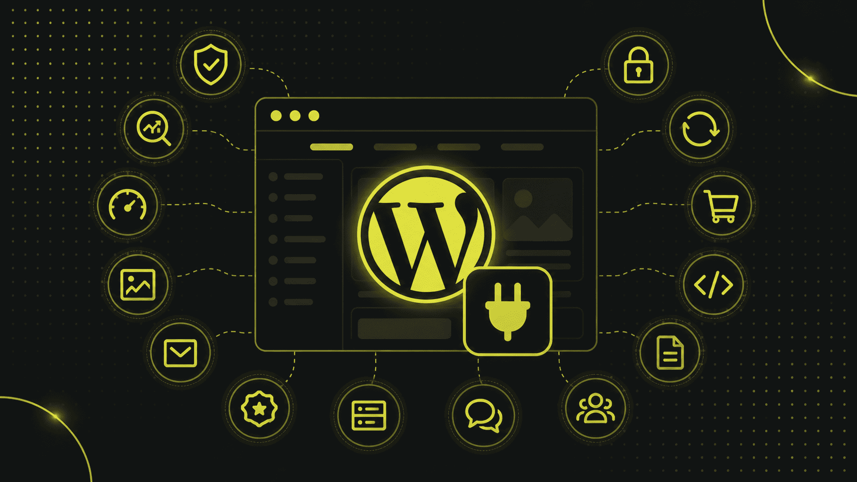
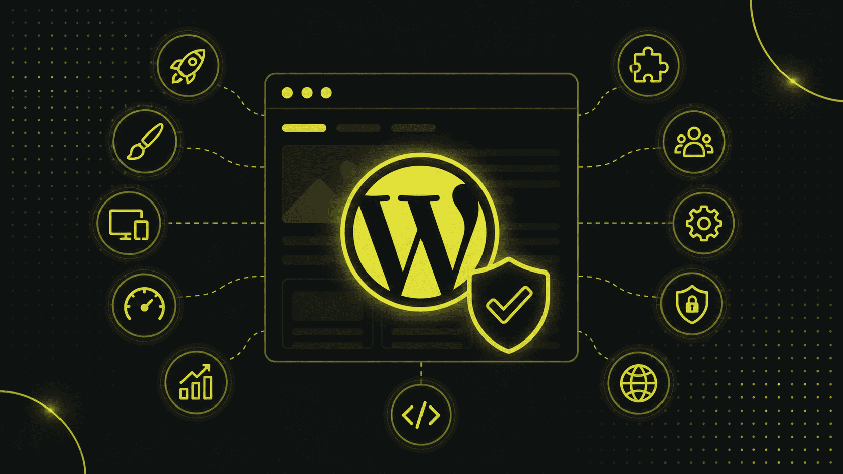
Many modern websites are based on a content management system (CMS) such as WordPress, Joomla, or Typo3.
The CMS makes it relatively easy to update content without having to write code every time.
Zudem braucht jede Website ein Hosting (Server), eine Domain (die Web-Adresse) und SSL-Verschlüsselung, damit sie über HTTPS sicher erreichbar ist.
At Beyondweb, we make sure that all of these elements work together.
Webdesign und Inhalte einerseits , die Technik andererseits.
The Path to a Finished Website: From Concept to Launch
Let’s take a look at the process I typically go through with a client as a web designer.
This will give you an idea of the steps involved in my work and where common misunderstandings can arise.
1. Concept & Planning
It always starts with a conversation.
As your customer, I listen carefully to what you have to say:
What do you hope to achieve with the website (goals)?
Welche Kunden möchtest du ansprechen?
Do you already have content or specific requirements?
In this phase, we work together to determine the direction we’ll take.
This results in a site map, i.e., the entire website structure in its rough form.
Wir legen fest, welche Unterseiten es geben wird, welche Navigation Sinn ergibt und welche Inhalte auf welche Seite kommen.
We will also clarify the issue of responsibilities:
Who provides the text, and who finds the images?
Werden externe Tools eingebunden (z. B. Newsletter-System, Buchungstool)?
This planning phase lays the groundwork and sets the foundation for everything that follows.
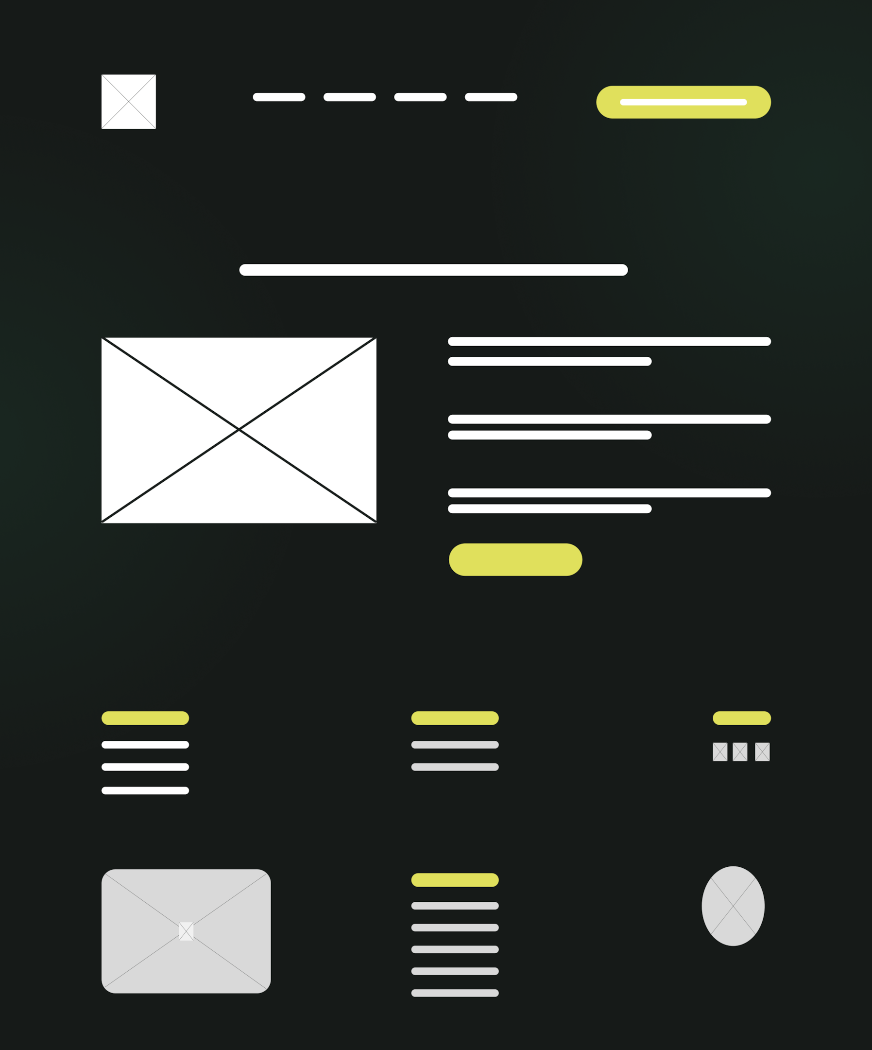
At this stage, I often draw wireframes—basic layout sketches—to visualize where everything goes, without any design frills.
Das ist hilfreich, um ein gemeinsames Verständnis vom Websiteaufbau zu bekommen.
SEO is also already incorporated into this phase:
Keyword research, crafting page titles and descriptions, etc., to ensure the website’s foundation is SEO-friendly.
2. Content, Wireframes & Design
Once the structure is in place, it's time to focus on the design.
I will develop a visual design concept in line with your corporate identity (CI).
However, I'm not going into too much detail just yet; I'm simply creating a design system.
Farben, Typografie, Bildsprache – all das wird definiert.
At the same time, the wireframes and content are created or prepared.
Wireframes define a rough layout with placeholders for text and images.
We create these using AI tools in conjunction with Figma.
The design layout is created after the content and wireframes have been approved.
We often start with the homepage and a subpage; once those are approved, the design is applied to all the necessary page types.
As a result of this step, you usually end up with static design mockups in Figma as well as finished text and images.
Some web designers skip the mockup stage and design directly in the browser using the actual content; it depends on their workflow.
It is important to note that:
In this step, you can see what the future website will look like and what content it will offer.
Feedback loops with the customer are common here (“Do you like the direction we’re taking? Should we present this element differently?” etc.).
Ziel ist es, ein Design zu entwickeln, das sowohl dem Auftraggeber gefällt als auch den Besuchern gerecht wird und natürlich dem definierten Zweck dient (sei es Vertrauensaufbau, Verkauf, Lead-Generierung etc.).
3. Technical Implementation
Now for the “under the hood” part.
Now it's time to turn the design into an actual website.
Nowadays, this is usually done using a CMS (content management system).
Ich installiere also z. B. WordPress auf dem Server (falls nicht schon vorhanden), richte die benötigten Plugins ein (etwa für SEO, Caching, Formulare) und implementiere das Layout.
At this stage, it's also important to make sure that everything is working properly:
Die Navigation klickt durch, die internen Verlinkungen passen, Bilder sind optimiert, der Header und Footer erscheinen überall korrekt, das Responsive Design (also die Ansicht auf Handy/Tablet) sitzt.
Oft prüfe ich in dieser Phase auch die Conversion-Elemente, also ob z. B. der „Jetzt kontaktieren”-Button auf jeder Seite präsent genug ist oder ob Formulare benutzerfreundlich sind.
Search engine optimization is also implemented technically:
Meta-Tags werden gesetzt, Überschriften mit Keywords sind integriert, Alt-Texte für Bilder sind hinterlegt, Ladezeiten sind optimiert, eine XML-Sitemap ist generiert.
These are all steps that are part of the process, but many people aren't even aware of them.
A good web designer doesn't overlook these details, because they can ultimately determine whether the site attracts and retains visitors.
4. Testing & Fine-Tuning
We'll run some tests before we go live.
And thoroughly.
We test every page in different browsers (Chrome, Safari, Firefox, and Edge if applicable) and on different devices.
Nothing is worse than a website that breaks on a smartphone because nobody tested it.
I click through every subpage and every link (QA – Quality Assurance).
This also includes:
Do all external links work?
Are form submissions being sent to the correct email address?
Are the legal texts correctly incorporated?
Does each page have a meaningful title and description for Google?
At this stage, requests for changes sometimes still come up—that’s normal.
I always build in some extra time for that.
5. Launch
Der grosse Tag: Die Seite geht online.
I'm moving the website from the development server to the live domain (or switching over if I've already been developing on the live URL).
As a web designer, I also coordinate this phase, including backups, domain settings, and the final launch.
But my work doesn't necessarily end after the launch.
Viele Kunden buchen mich (oder unser Team) für die Wartung oder Weiterentwicklung.
Eine Website ist ein wenig wie ein Garten:
If you want it to bloom, you have to take care of it.
Das heisst, ich stehe bereit für künftige Updates, neuen Content (z. B. Blog-Artikel), neue Unterseiten, technische Updates.
Ich überwache auch die Leads und das Verhalten der Besucher (z. B. mit Analytics) und optimiere bei Bedarf.
This highlights another aspect of the web designer's role:
Wir denken langfristig mit und beraten auch nach dem Go-live weiter.
Manche Vorstellungen, die anfangs bestanden, erweisen sich in der Praxis als anders. Dann justieren wir nach, immer mit Blick auf das Gesamtziel.
These phases illustrate:
A web designer has a wide range of responsibilities.
Vom kreativen Gestalter über den strukturierten Planer bis zum Technik-Allrounder und Online-Marketing-Versteher.
It is precisely this combination that makes the job so exciting for me and so valuable for you as a client.
You'll receive a comprehensive package that ensures your online presence is solid and well-rounded.
Misconceptions and outdated ideas in web design
Trotz der Vielfalt an Aufgaben kursieren einige Missverständnisse darüber, was Webdesign leisten kann oder wie eine Website entstehen sollte.
Here are a few common assumptions.
Maybe you'll recognize yourself or your colleagues in this.
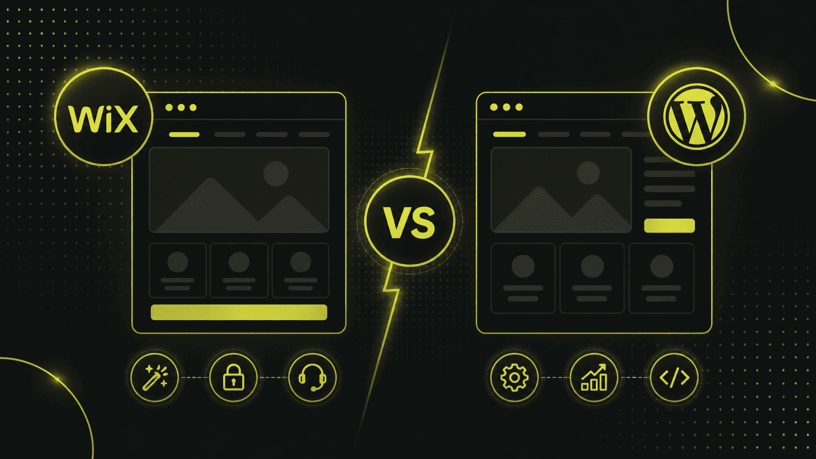
Anyone can do web design—there are drag-and-drop templates, after all!
It's true—there are plenty of website builders and pre-made themes available today.
And they're fine for beginners or very simple projects.
However, this sometimes leads to the assumption that a professional web designer is no longer necessary.
The reality:
A toolkit provides you with a template, but not a strategy.
I've personally seen clients who built a nice website using Wix or Jimdo but didn't generate any leads from it.
Why?
Because important elements were missing, the website's structure was unclear, and SEO had not been taken into account.
A web designer, on the other hand, creates the site in a way that is optimized for your goals.
You'll see the results of your investment later on: more visitors, more inquiries, and greater brand impact.
Plus, with customizations and features, I can cater to your needs in a way that a rigid, off-the-shelf solution simply can't.
Of course, I use templates sometimes, but I know how to customize and expand them.
So the value doesn't lie in the technical aspect of "clicking things together"—anyone can do that—but in the conceptual and design expertise behind it.
A homepage is enough; there's no need for subpages
A fallacy I used to hear quite often, especially in the past: “We’ll just put everything on one page—you can just scroll down.”
Single-Page-Websites (One-Pager) sind zwar modern und manchmal sinnvoll (z. B. für ein einzelnes Produkt oder Event), aber für ein etabliertes Unternehmen mit mehreren Leistungen stösst das Konzept an Grenzen.
Without subpages, you can't build a structured website, delve into specific topics, and you'll also be missing out on SEO opportunities.
Google prefers that each page focus on a single topic.
Zudem können One-Pager unübersichtlich werden, wenn zu viele Informationen darauf müssen.
Ein Webdesigner wird dich beraten, ob ein One-Pager oder ein mehrseitiger Aufbau besser ist.
And if there are multiple pages, it ensures clear navigation between them (keyword: internal linking).
It’s often a good idea to combine the two: a streamlined main page that provides an overview, followed by detailed pages.
In any case, the idea that “one page is enough” is outdated for most professional websites.
Web designer = web developer—they're the same thing, right?
Not quite.
These two terms are often confused.
A web developer programs the functionality (front-end and/or back-end), while a web designer focuses more on the concept and visual design.
However, the lines between roles tend to blur, especially in small projects.
In many cases, I personally handle both the design and the front-end development, because HTML, CSS, and WordPress are part of my craft.
But I also know my limits.
For complex web applications or database-related tasks, I would bring in a developer.
It is important to note that:
Als Kunde solltest du wissen, dass “Webdesign” nicht nur Pixelschubsen ist, sondern dass im Hintergrund viel technisches Verständnis erforderlich ist.
If someone claims that web designers are just artists with no technical skills, that’s really outdated.
Die besten Webdesigner bringen beides mit: ein Auge fürs Design und Verstand für den Code.
Hauptsache, die Seite sieht toll aus, der Rest ergibt sich schon.
That is a dangerous mistake.
Of course, an appealing design is important.
It conveys professionalism and builds trust.
But what good is the most beautiful website if its layout is chaotic, the content is sparse, or there’s no clear call to action?
I've seen websites that win design awards, yet the owner complains that no one calls or buys anything.
This is often because, while the graphics are attractive, the user guidance is lacking.
A classic example:
There are fancy animations everywhere, but the menu is hidden somewhere as an inconspicuous icon.
Many visitors can't find it and get lost.
Or a huge video plays in the header, but the actual value of the offer isn't explained anywhere.
My approach as a web designer (especially for SMEs in the DACH region) is therefore: form follows function.
Only once it’s clear what the site is meant to achieve and how the content should be structured can we add the finishing touches with a sleek design.
And even then, I keep testing:
Are users able to navigate the site?
Are we achieving the desired conversion rate?
Web design isn't an art project; it always serves a practical purpose.
Das dürfen manche ästhetikverliebte Designer nicht vergessen.
Once a website is complete, it remains as is and requires no further attention.
Many people think that once the website is live, the matter is settled.
But the web is dynamic.
Content becomes outdated, Google changes its algorithm, and users may expect a more modern design after two or three years.
That's why I never consider the pages I create to be set in stone.
Good web designers often offer to maintain the site after it’s been built, or at least to check it from time to time (keywords: updates, security, performance checks).
Unfortunately, some companies cut corners here and let their website languish, with the result that technical problems eventually arise or the competition pulls ahead.
My advice: Think of your website as a dynamic part of your marketing strategy.
Halte Inhalte aktuell (z. B. neue Blog-Artikel), überprüfe die interne Verlinkung und Navigation ab und zu auf Optimierungspotenzial und schau dir an, wie Besucher sich verhalten (Analytics-Daten).
Web design doesn't end on launch day.
And a web designer can continue to offer advice and support to help you keep improving your website.
Conclusion: A well-designed website lays the foundation for your online success
A well-structured, appealing website builds trust with your customers and keeps their attention.
It guides users directly to the information or actions that are relevant to your business.
It ranks higher in search engines because its structure and content have been optimized.
And ultimately, it will generate more leads, inquiries, or sales for you, because every element of the website is designed to help you achieve your goals.
Natürlich kannst du versuchen, das alles selbst zu stemmen und ChatGPT zu fragen, die Tools dafür waren noch nie so zugänglich wie heute.
But as you now know, a truly successful website requires a great deal of conceptual and design work.
An experienced web designer (or a team, depending on the size of the project) will take care of this complex task for you and bring valuable expertise to the table: on aspects such as structure and layout, design trends, search engine optimization, user behavior, technology, and more.
Ultimately, it’s not just about having a website online—it’s about making sure it works for you.
It should serve as the foundation of your website's digital presence and continuously attract new customers and prospects to your business.
That's why it's worth investing in good web design.