
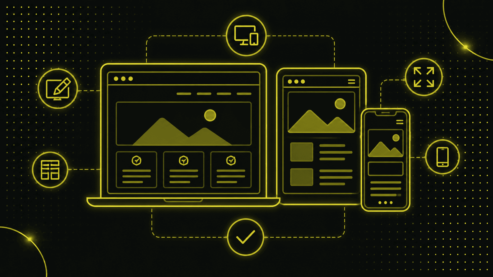
Einführung in responsive Webdesign
Responsive Webdesign ist eine Website so zu gestalten, dass sie auf verschiedenen Gärten (Tablet, iPhone etc) und Bildschirmgrössen optimal dargestellt wird.
The layout, content and navigation adapt flexibly to the respective conditions of the device used.
Origin and development
The origins of responsive design can be traced back to the challenges that came with the growing spread of smartphones and tablets.
In the past, separate versions of a website were created for desktop and mobile devices, which not only cost twice as much, but was also inefficient.
Why is responsive design important?
User-friendliness and accessibility
Imagine visiting a website and having to repeatedly zoom in or scroll to read the content - that would be pretty frustrating, wouldn't it?
A responsive design ensures that users have a pleasant experience regardless of the device they are using. The optimal display and simple navigation contribute significantly to user-friendliness and accessibility.
Improve your Google ranking
Since April 2024, Google now gives even greater preference to websites that are optimized for mobile devices, i.e. are responsive.
So werden Websites, die nicht responsive sind, auch gar nicht mehr von Google indexiert!
A responsive web design can therefore have a direct influence on your ranking in the search results.
Adaptation to different devices
Responsive design enables a uniform presentation of the website on all devices, including desktop PCs.
Regardless of whether a visitor accesses your site from a smartphone, tablet or desktop computer, the website automatically adapts to the available screen size. This keeps the user experience consistent and pleasant.
For more information on how you can optimize your website for mobile, get in touch for a no-obligation consultation.
Basics of responsive web design
Fluid layouts
A fluid layout adapts flexibly to the width of the display device. Instead of using fixed pixel values, relative units such as percent, REM or EM are used.
This means that the layout remains dynamic and can react to any screen size.
Flexible images
Flexible images, also known as adaptive images, also adapt to the screen width. Flexible images ensure that the mobile version does not necessarily have to correspond 100 percent to the desktop version. The use of relative units (such as % instead of px) ensures that images do not protrude beyond the limits of the container and therefore do not destroy the layout.
Media Queries
Media queries are one of the central techniques of responsive web design. You can use them to define CSS rules that are only applied under certain conditions (such as screen width). Here is a simple example:
```css
@media (max-width: 600px) {
body {
background-color: lightblue;
}
}
```
This code changes the background color of the page to light blue if the screen width is 600 pixels or less. You can find out more about Media CSS3 Media Queries in this detailed article from W3 Schools.
Advantages of responsive web design
Cost efficiency
Instead of creating and maintaining multiple versions of a website (for desktop and mobile devices), responsive design reduces the effort by using a single design.
This not only saves money, but also reduces maintenance costs. You can find everything you need to know about the costs of a website in our article.
Improving the user experience
A uniform and consistent appearance on all end devices significantly improves the user experience. Visitors can be sure that they will find the content easily and quickly, regardless of which device they are using.
Increased dwell time and conversion rate
Websites that are user-friendly and easy to navigate lead to longer user visits and thus increase the chances of conversions.
Whether it's buying a product or filling out a contact form, a smooth user experience is the key to greater success.
Implementation of responsive design
Best practices and examples
Modern CSS features: clamp(), calc() and others
Many modern CSS features can help to create a flexible and efficient responsive design. Particularly useful are functions such as `clamp()` und `calc()`.
These functions make it possible to create dynamic values that change depending on the screen size.
Example for `clamp()`:
```css

font-size: clamp(1rem, 2vw, 2rem);

```
In this case, the font size adapts to the screen width, but remains within the specified minimum and maximum values.
Beispiel für `calc()`:

```css

width: calc(100% - 20px);

```
This function makes it possible to use more complex calculations within CSS and thus design more flexible layouts.
Media queries vs. modern CSS methods
In the past, media queries were mainly used to create different layouts for different screen sizes. Modern CSS methods help to adapt content based on the available viewport, which is crucial for a flexible and responsive design.
Although media queries are still useful, modern CSS methods can minimize the use of media queries and at the same time make the code base leaner and more maintainable.
Use of Flexbox instead of column systems
The use of Flexbox has revolutionized the way we create layouts. Instead of using complex 12-column systems, Flexbox layouts can be designed to be flexible and customizable. Here is an example of a flexbox layout:
```css

.container {

  display: flex;

  flex-direction: column;

}

@media (min-width: 768px) {

  .container {

    flex-direction: row;

  }

}

```
Practical tips for using Figma designs
If you create designs in Figma, there are a few practical tips that can make your life easier:
- Use `clamp` for everything that should change between mobile and desktop.
- Use `rem` values for everything except borders and 1px wide lines or separators.
- Avoid fixed width values; use percentages and maximum widths instead.
Tools and techniques
There are numerous useful tools and techniques for implementing responsive design:
Important tools and software
- Figma or Sketch: Use these tools to create and test responsive design layouts.
- Browser development tools: All major browsers offer tools to test websites in different views.
- Frameworks such as Bootstrap or Foundation: These offer ready-made responsive design components and layouts.
Common mistakes and how to avoid them
There are some common mistakes when implementing responsive design that you should avoid:
- Avoidance of fixed width values in favor of flexible values.
- Don't forget to define viewports and meta tags in the header of your HTML documents.
- Test your design on different devices and browsers to make sure everything works as it should.
Find out more about our web design services.
The future of responsive web design
Trends and developments
The field of responsive design is constantly evolving. With the emergence of new technologies and tools, best practices and approaches are also changing. Here are some of the most important trends and developments:
Progressive Web Apps (PWAs)
Progressive Web Apps kombinieren das Beste aus Web- und Mobile-Apps und bieten eine nahtlose Benutzererfahrung. Sie sind darauf ausgerichtet, auch unter schlechten Netzwerkbedingungen schnell zu laden, und können offline genutzt werden.
For web designers and developers, this means that they need to apply responsive design principles to even more powerful and robust applications.
Mobile-first approach
The mobile-first approach has become increasingly important as the majority of Internet use is now via mobile devices.
This means that web designs should first be conceived for mobile devices and then expanded for larger screens. This ensures that the user experience on small devices is not neglected.
The mobile-first approach and PWAs are not just trends, but decisive paradigm shifts in web design. The mobile-first approach requires designers and developers to prioritize mobile devices and optimize for them. This improves performance and user-friendliness on all end devices.
PWAs hingegen ermöglichen, Webanwendungen zu erstellen, die wie native Apps funktionieren. Sie bieten Push-Benachrichtigungen, Offline-Funktionalität und hohe Performance, was sie zu einer mächtigen Ergänzung des responsiven Design-Arsenals macht.
The implementation of these modern techniques can have a significant impact on the user experience and the overall performance of the website.
Sie helfen nicht nur dabei, eine hohe Benutzerzufriedenheit zu gewährleisten, sondern auch dabei, die SEO-Performance zu verbessern.
Conclusion
Summary and concluding thoughts
Responsive Design ist unerlässlich in einer Zeit, in der Nutzer das Internet auf einer Vielzahl von Geräten und Bildschirmgrössen nutzen.
Durch die Anpassung des Layouts, der Inhalte und der Navigation an unterschiedliche Endgeräte gewährleistet es eine optimale Benutzererfahrung und verbessert zugleich die SEO-Performance.
From the use of fluid layouts and flexible images to the use of modern CSS techniques such as `clamp()` and `calc()` through to media queries - there are numerous methods of implementing responsive web design.
Die Vorteile sind klar: Kosteneffizienz, Verbesserung der Benutzererfahrung, erhöhte Verweildauer und Conversion Rate.
Ebenso ermöglichen neue Trends wie der Mobile-First Ansatz und Progressive Web Apps (PWAs) noch leistungsfähigere und benutzerfreundlichere Webseiten.
Benefits for companies and developers
Für Unternehmen bedeutet eine responsive Website nicht nur eine bessere Nutzererfahrung, sondern auch eine höhere Sichtbarkeit in Suchmaschinen und somit potenziell mehr Besucher und Kunden.
Entwickler profitieren von einer einheitlichen Codebasis und einem effizienteren Workflow.
Das Responsive Design ist nicht nur eine technische Anforderung, sondern eine strategische Entscheidung, die langfristig die Wettbewerbsfähigkeit einer Website sichert.
Die kontinuierliche Weiterentwicklung und Anpassung an neue Technologien und Nutzergewohnheiten bleibt allerdings unerlässlich.
For more tips and detailed guides on implementing responsive web design, check out our other blog posts and resources on Beyondweb.


