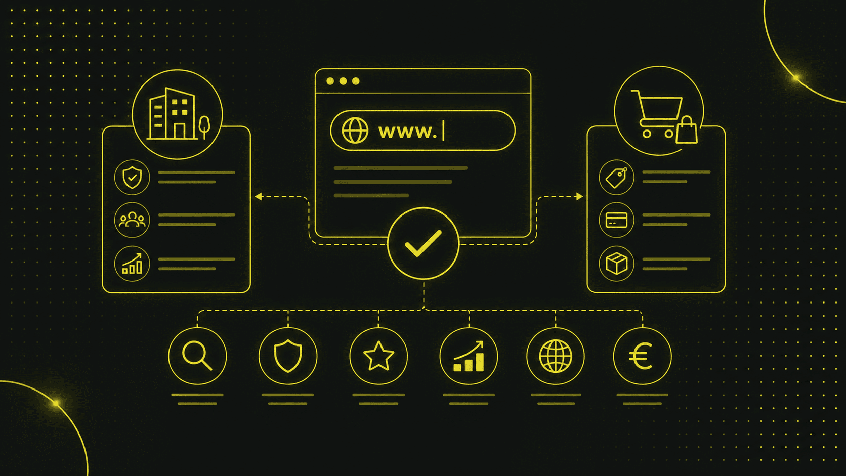

Visuelle Designtrends 2026
Das visuelle Erscheinungsbild einer Website entscheidet in Sekunden über das Interesse deiner Besucher und die Wahrnehmung deiner Marke.
Im folgenden Abschnitt zeigen wir die wichtigsten visuellen Trends 2026 und geben dir praxisnahe Tipps für die eigene Umsetzung.
Bright & Bold
Knallige Farben und grossformatige Schriftzüge erobern im Jahr 2026 die Bildschirme.
Durch den Einsatz von kräftigen Farbflächen setzt du starke visuelle Anker, die sofort ins Auge springen und Besucher neugierig machen.
Im Dark Mode kommen leuchtende Neon-Töne besonders gut zur Geltung und verleihen deiner Website einen modernen Look.
Solche Trends steigern die Aufmerksamkeit.
Trotzdem ist es wichtig, dass du solche Techniken mit Bedacht einsetzt.
Die Benutzerfreundlichkeit und Farbharmonie müssen erhalten bleiben.
Um dir ein Beispiel aus unserer Praxis zu geben:
Bei unserem Projekt für CUAG Sports AG haben wir mit einem mutigen Farbschema gearbeitet.
Dadurch konnten wir die Markenidentität stärken und die durchschnittliche Verweildauer um 20 % erhöht.
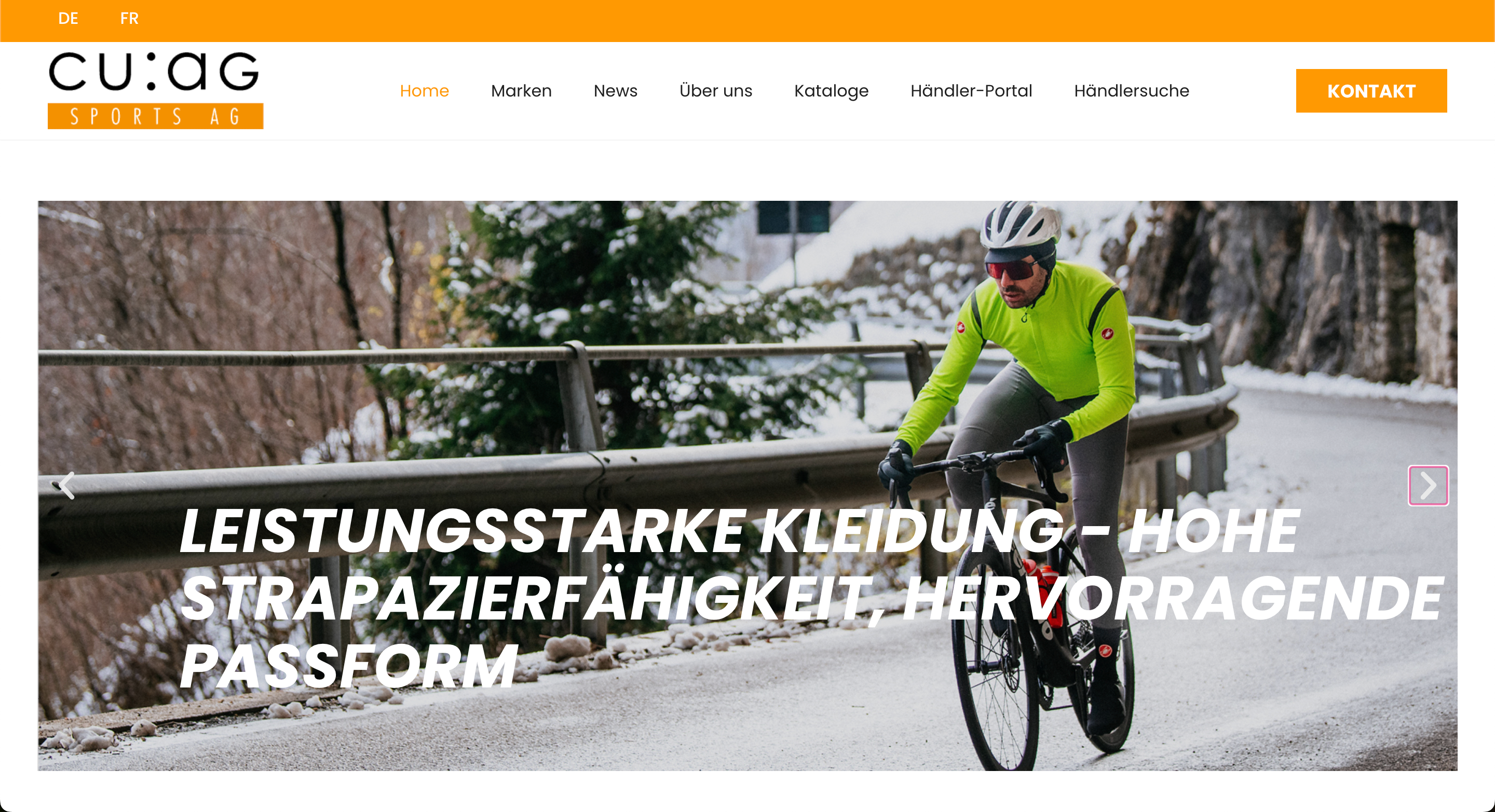
Das zeigt: der richtige Einsatz von knalligen Farben und grossformatigen Schriftzügen kann sich lohnen.
Pastell vs. Dopaminfarben
Sanfte Pastelltöne stehen kontrastreich neben lebhaften Dopaminfarben und schaffen damit ein sehr spannendes Spannungsfeld.
Pastellfarben wirken beruhigend und vermitteln Seriosität, während Dopaminfarben durch ihre hohe Sättigung ein positives Nutzererlebnis erzeugen.
Die Kombination dieser Farben kann in verschiedenen Layouts für überraschende Effekte sorgen und deine Inhalte strukturieren.
Mein Tipp: Nutze Pastelltöne für Hintergrundflächen und setze gezielt Dopaminakzente auf Buttons oder Icons, um Klickanreize zu schaffen.
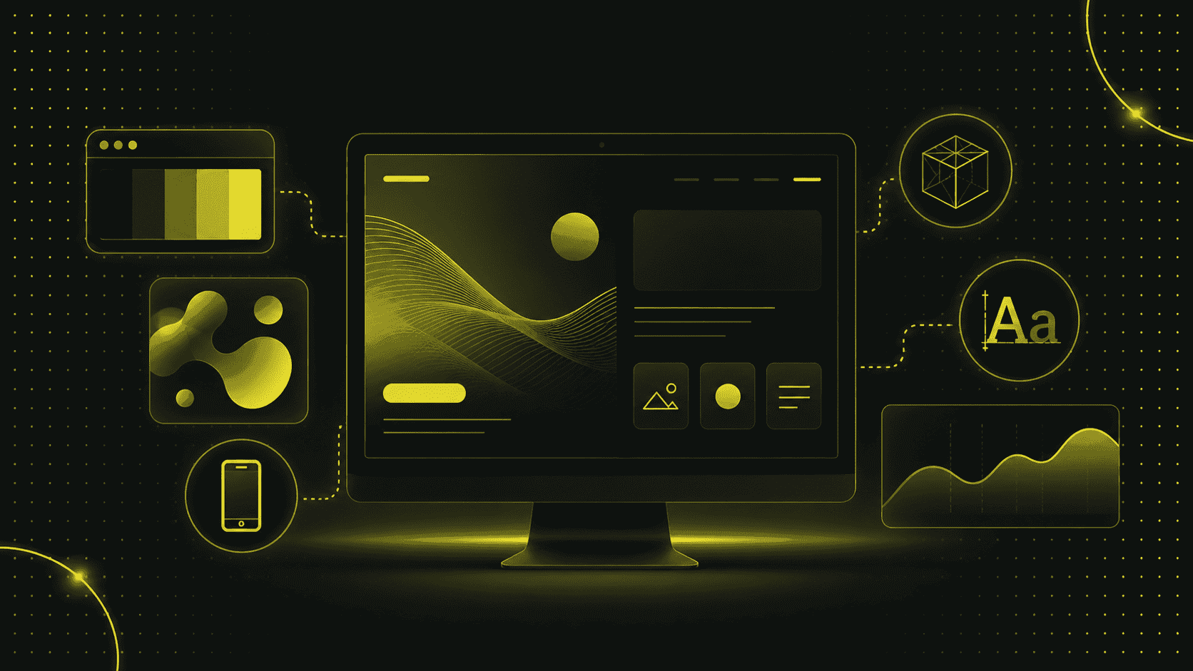
Flat & Glassmorphismus
Flat Design ist ein klarer, reduzierter Stil ohne Schatten, Verläufe oder überflüssige Verzierung.
Er fokussiert sich auf einfache Formen, kräftige Farben und eine klare Typografie.
Das sorgt für schnelle Ladezeiten und eine minimalistische User-Experience, bei der die Inhalte im Vordergrund stehen.
Glassmorphismus erweitert diesen Ansatz um halbtransparente Flächen, die wie “frostiges Glas“ wirken.
Dabei liegen die Glaselemente über unscharfen Hintergründen, wodurch Tiefe und ein leichter 3D-Effekt entstehen, ohne dass schwere Grafiken geladen werden müssen.
Mittlerweile hat sich gezeigt, dass diese Kombination vor allem in Progressive Web Apps (PWA) und modernen Web-Applikationen beliebt ist.
Warum aber Glassmorphismus?
- Durch den verschwommenen Hintergrund hinter Glas-Overlays rücken wichtige Elemente in den Fokus.
- Das Glas-Feeling wirkt futuristisch und hochwertig, gerade in Dark Mode-Layouts.
- Im Unterschied zu echten 3D-Modellen belastet Glassmorphismus die Seite kaum, da er mit CSS-Effekten realisiert wird.
KI-gestützte Design-Tools wie Figma-Plugins oder spezialisierte KI-Generatoren können dir dabei helfen, passende Farb- und Transparenzwerte automatisch zu ermitteln.
Damit kannst du Glassmorphismus-Styles schnell an deine Benutzeroberflächen anpassen und konsistent in verschiedenen Layouts einsetzen.
Brutalismus & Messiness
Brutalismus im Webdesign orientiert sich an der Architekturrichtung des Brutalismus: klare Formen, rohe Materialien und sichtbare Strukturen.
Im digitalen Kontext bedeutet das: einfache, oft klobige Layouts, scharfe Kanten, unerwartete Farbkombinationen und eine bewusst grobe Typografie.
Der Look wirkt unfertig oder minimalistisch hart, weil er auf perfekt geglättete Oberflächen verzichtet.
Messiness ergänzt diesen Ansatz durch gezielt platzierte Unregelmässigkeiten.
Das können zum Beispiel handgezeichnete Elemente, leicht versetzte Raster oder ungleich grosse Buttons sein.
Diese scheinbare „Unordnung“ verleiht deiner Website Persönlichkeit und erinnert Besucher daran, dass hinter dem Interface ein menschlicher Designer steht.
Du fragst dich nun wahrscheinlich, warum so etwas wie Brutalismus und Messiness funktionieren kann?
Ganz einfach:
- Unpolierte Gestaltungen signalisieren Mut und Echtheit.
- Im Vergleich zu den meisten anderen, perfekt abgestimmten Webseiten sticht ein solcher Retro-Look sofort ins Auge.
- Gerade junge Unternehmen oder kreative Projekte können sich so als unkonventionell positionieren.
Meine Tipps für die Umsetzung:
- Klare Struktur beibehalten: Auch wenn Formen roh wirken, solltest du ein logisches Raster einhalten, damit Nutzer sich nicht verirren.
- Lesbarkeit sichern: Wähle kontrastreiche Schriftfarben und ausreichende Abstände, besonders bei ungewöhnlichen Typografien.
- Gezielte Dosierung: Nutze Messiness nur für einzelne Bereiche (z. B. Header oder Call-to-Action), um es mit der Wirkung nicht zu übertreiben.
- Testing: Überprüfe die User-Experience mit echten Nutzer:innen, um sicherzustellen, dass Interaktionen wirklich intuitiv bleiben.
Retro-Futurismus
Retro-Futurismus verbindet nostalgische Y2K-Elemente wie klobige Pixel-Schriften, Neonfarben und einfache Icons mit modernen 3D-Elementen und glatten Oberflächen.
Dieser Stil zitiert den Optimismus vergangener Technikvisionen und katapultiert ihn direkt in das Jahr 2026.
Er schafft so eine Zeitreise, die vor allem bei älteren Nutzer:innen Erinnerungen weckt und gleichzeitig das Potenzial moderner Technologie aufzeigt.
Nostalgie weckt Emotionen, während futuristische Grafiken den Blick nach vorn richten.
So erzielst du eine User-Experience, die einerseits vertraut, aber auch überraschend wirkt.
Handgezeichnete Illustrationen & Mixed Media
Persönliche, handgezeichnete Illustrationen verleihen deiner Website eine gewisse Einzigartigkeit und stärken deine Markenbotschaft.
In Kombination mit Fotocollagen oder Mixed Media-Elementen entsteht ein lebendiges Gesamtbild, das sich deutlich von Standard-Stockfotos abhebt.
Solche Designs fördern die Interaktivität und laden Besucher dazu ein, sich intensiver mit deinen Inhalten auseinanderzusetzen.
An dieser Stelle möchte ich dir wieder ein Beispiel aus einem unserer Kundenprojekte geben.
Für Herzka haben wir mehrere handgezeichnete Skizzen verwendet, die für den Kunden gezeichnet wurden.
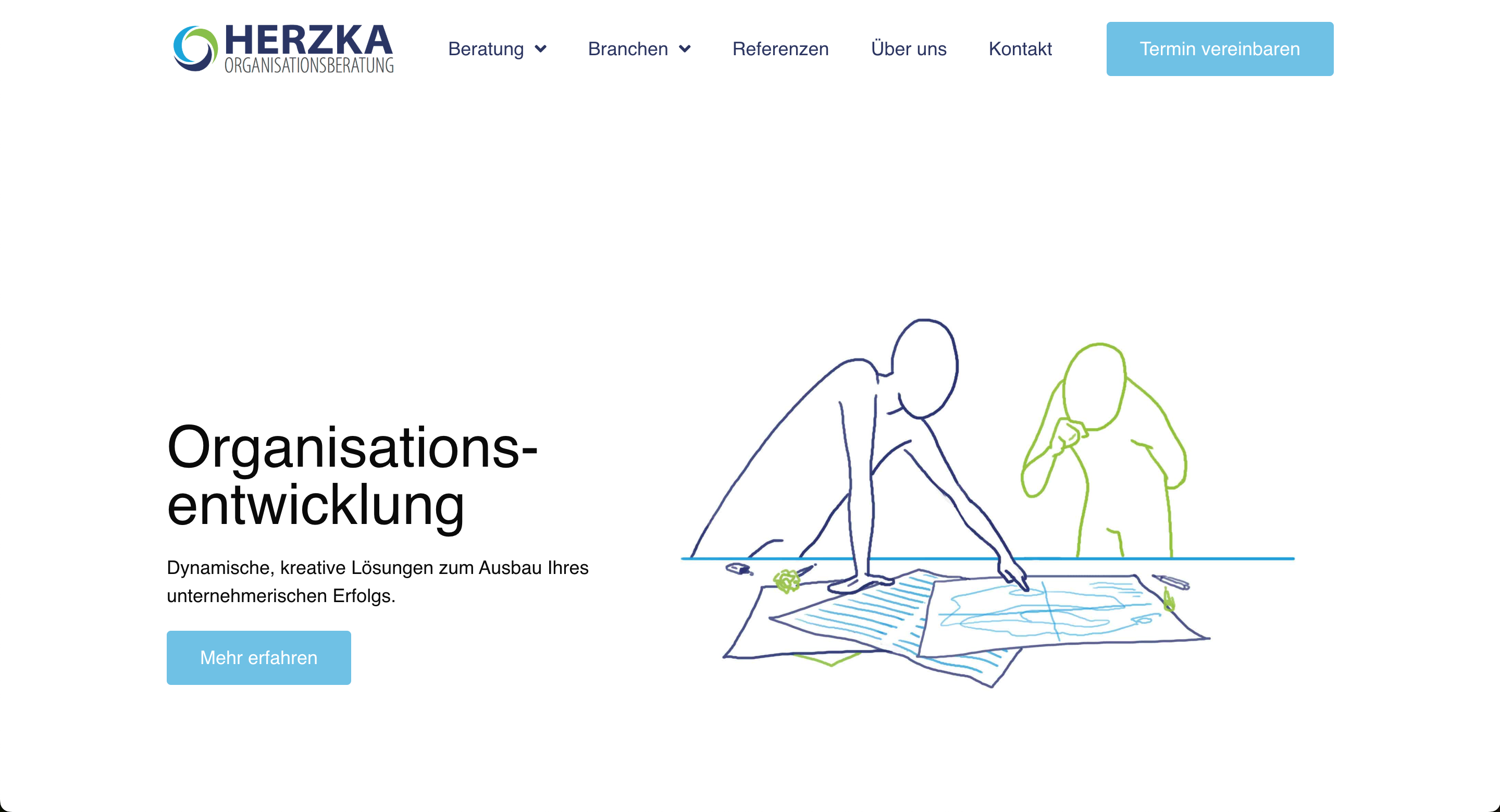
Damit konnten wir eine vertraute, fast greifbare Nutzererfahrung schaffen.
Geometrische und organische Formen
Geometrische Muster schaffen Struktur und Klarheit, während organische Formen Weichheit und Natürlichkeit vermitteln.
Die Kombination erlaubt dir, gezielt Blickführungen zu steuern und Inhalte in ansprechende Module zu gliedern.
Durch den Einsatz von SVG-Formen oder CSS-Grids kannst du solche Layouts performant umsetzen und flexibel an verschiedene Bildschirmgrössen anpassen.
Gerade auf OLED-Bildschirmen kommen kontrastreiche Geometrien besonders gut zur Geltung und verbessern die Ästhetik deiner Website.
UI- und UX-Trends 2026
Die Art und Weise, wie Nutzer mit einer Website interagieren, verändert sich ständig.
Damit deine Besucher sich wohlfühlen und länger bleiben, braucht es also mehr als nur schicke Grafiken.
Im folgenden Abschnitt zeige ich dir deshalb die aktuellen UI- und UX-Trends, damit du weisst, wie du die Interaktivität und die Benutzerfreundlichkeit deiner Webseite optimal verbessern kannst.
Scrollytelling & horizontales Scrollen
Scrollytelling verknüpft Storytelling mit Bewegung.
Während du vertikal oder horizontal scrollst, entfaltet sich der Inhalt wie ein Comic, eine Infografik oder ein Mini-Film.
Vor allem auf kleinen Bildschirmen kann horizontales Scrollen ein vertrautes Smartphone-Gefühl erzeugen.
Das sorgt für eine überraschende User-Experience und bindet das Publikum stärker ein.
Mein Tipp: Achte auf visuelle Hinweise wie Pfeile oder animierte Icons, damit deine Nutzer verstehen, dass sie scrollen sollen.
Experimentelle Navigation & Hamburger-Menüs auf Desktop
Weg von Standard-Menüs, hin zu unerwarteten Navigationsmustern.
Experimentelle Navigation kann zum Beispiel eine seitliche Leiste sein, die beim Hover aufpoppt, oder ein Hamburger-Menü, auch auf dem Desktop.
So wirkt deine Website modern und schafft klare Schwerpunkte.
Aber Achtung!
Wichtig ist, dass der Zugang zu deinen Inhalten sofort erkennbar bleibt.
Hier lohnt es sich, deine Ideen mit echten Nutzer:innen zu testen.
Dadurch kannst du sicherstellen, dass deine Navigation nicht zum Stolperstein wird.
Micro-Interactions & taktile Erlebnisse
Micro-Interactions sind kleine Animationen oder visuelle Rückmeldungen, die entstehen, wenn Nutzer klicken, scrollen oder tippen.
Ein Button, der beim Drüberfahren pulsiert, oder ein Icon, das sich leicht verformt.
Diese kleinen Details machen eine Website lebendig.
Sie steigern die Intuitivität und lassen deine Besucher spüren, dass ihre Aktion registriert wurde.
So gestaltest du eine benutzerfreundliche Online-Erfahrung, die in Erinnerung bleibt.
Seamless Page Transitions
Weiche Übergänge zwischen Seiten oder Sektionen vermitteln ein Gefühl von Kontinuität.
Anstatt abrupt zu wechseln, gleiten Inhalte ineinander oder verblassen sanft.
Das reduziert die Ladewahrnehmung und wirkt professionell.
Ein nahtloser Wechsel trägt ausserdem dazu bei, dass deine Website nicht nur schnell, sondern auch hochwertig wirkt.
Big Walls of Text
Grosse Textblöcke können überraschen, wenn sie denn richtig eingesetzt werden.
Mit ausreichend Weissraum, klaren Absätzen und typografischen Akzenten kannst du längere Texte ansprechend präsentieren.
Big Walls of Text eignen sich hauptsächlich für Geschichten, Tutorials oder umfangreiche Artikel, in denen du tiefer in ein bestimmtes Thema eintauchen möchtest.
Mein Tipp: Nutze bei grossen Textblöcken Scroll-Indikatoren oder Inhaltsverzeichnisse.
Damit hilfst du deinen Nutzern, damit sie sich im Text nicht verlieren.
Kreative Textausrichtungen & Typografie-Experimente
Es lohnt sich oft, mit Schriftschnitten, -grössen und Ausrichtungen zu spielen.
Vertikale Überschriften, in den Rand gerückte Textblöcke oder diagonal verlaufende Linien schaffen unerwartete Leseerlebnisse.
Solche Typografie-Experimente sind ein starkes Stilmittel im Jahr 2026.
Sie heben deine Markenbotschaft hervor und sorgen dafür, dass deine Besucher deine Inhalte länger im Gedächtnis behalten.
Achte aber darauf, dass die Lesbarkeit erhalten bleibt, und kombiniere maximal zwei bis drei Schriftfamilien, um das Design nicht zu überladen.
Technologische Trends im Webdesign 2026
Design allein reicht heute nicht mehr.
Wenn Websites im Jahr 2026 wirklich überzeugen sollen, brauchen sie auch technologisch ein solides Fundament.
Schnelle Ladezeiten, smarte Features und ein interaktives Erlebnis gehören längst zum Standard, und das Web entwickelt sich rasend schnell weiter.
Deshalb zeige ich dir im folgenden Abschnitt, welche Technologien du jetzt auf dem Schirm haben solltest und wie du sie sinnvoll einsetzt.
AI-generierte Designs und Illustrationen
KI verändert gerade, wie wir gestalten.
Mit Tools wie Framer AI, Uizard oder Relume kannst du komplette Layouts, Farbschemata oder sogar ganze Landingpages in Minuten generieren lassen.
Auch Illustrationen lassen sich über KI erstellen.
Zum Beispiel für Hero-Bilder oder individuelle Icons, die perfekt zum Look deiner Brand passen.
Das spart Zeit und bringt frische Ideen rein.
Aber Achtung!
KI ersetzt nicht das, was Designer:innen wirklich ausmacht.
Denn Menschen haben im Gegensatz zu KI ein gutes Gespür und einen ganz anderen Blick fürs Detail.
Intelligente Chatbots & Voice-User-Interface
Stupide Chatbots mit fünf Antwortmöglichkeiten sind Geschichte.
2026 setzen viele Websites auf smarte Systeme, die Nutzer:innen wirklich verstehen.
Das ist dank Natural Language Processing, dynamischer Antworten und Kontextbezug möglich.
Auch die Sprachsteuerung wird präsenter, vor allem im Bereich der Barrierefreiheit oder auf Mobile.
Das heisst: Deine Website hört zu und reagiert.
Das schafft Nähe, spart Supportaufwand und zeigt, dass du technologisch mit den neuesten Standards mithältst.
3D-Modelle & Hyperrealität
3D ist nicht mehr nur etwas für Gamer oder Architektur-Websites.
2026 setzen immer mehr Unternehmen auf interaktive 3D-Elemente, um ihre Produkte oder Services realer, greifbarer und spannender zu präsentieren.
Statt eines statischen Fotos lässt sich ein Produkt im Browser drehen, kippen oder sogar auseinandernehmen.
Besonders bei erklärungsbedürftigen Angeboten – etwa technischen Geräten, Möbeln oder Software-Plattformen – schafft das einen echten Mehrwert.
Nutzer können sich selbst durch das Objekt bewegen und es im eigenen Tempo entdecken.
Das steigert nicht nur die Verweildauer, sondern baut auch Vertrauen auf.
Dank Webtechnologien wie Three.js oder Babylon.js lassen sich solche Modelle direkt im Browser einbauen.
Mit etwas KI-Unterstützung (z. B. durch automatisierte Texturerstellung oder Lichtsimulation) kannst du sogar fotorealistische Ergebnisse erzielen – und das deutlich schneller, als man denkt.
Hyperrealität geht noch einen Schritt weiter:
Hier verschwimmen Grenzen zwischen echter und digitaler Welt.
Dazu gehören zum Beispiel animierte Umgebungen, Schattenwürfe in Echtzeit oder Lichteffekte, die auf Mausbewegungen reagieren.
Richtig eingesetzt entsteht so ein immersives Erlebnis, das sich wie ein Mini-Metaverse anfühlt, nur eben auf deiner Website.
Natürlich gilt auch hier:
Es muss nicht gleich die Full-3D-Welt sein.
Schon kleine 3D-Elemente – etwa ein Produkt, das sich leicht dreht, wenn man scrollt – reichen oft aus, um Eindruck zu hinterlassen.
Wichtig ist, dass Performance und Ladezeiten stimmen.
Und dass die Nutzer:innen am Ende nicht nur schauen, sondern im Idealfall auch klicken, verstehen und kaufen.
Smart-Videos & Animationen
Videos werden 2026 interaktiver.
Sie starten bei Scroll, pausieren automatisch oder passen sich dem Verhalten der Nutzer:innen an.
Auch Animationen werden klüger eingesetzt.
Nicht nur um visuelle Anreize zu schaffen, sondern vor allem auch um Inhalte besser verständlich zu machen.
Wichtig ist aber: Du darfst nicht alles animieren.
Smarte Bewegung funktioniert dann gut, wenn sie gezielt eingesetzt wird und dem Flow hilft.
Greifst du zu oft darauf zurück, wirkt es eher störend.
Progressive Web Apps (PWA) und Web-Applikationen
PWAs verbinden die Vorteile klassischer Websites mit dem Feeling einer App.
Sie laufen offline, lassen sich auf dem Startbildschirm speichern und wirken wie native Anwendungen, nur eben im Browser.
Gerade wenn du ein digitales Produkt hast oder viel wiederkehrende Nutzung willst (z. B. bei Buchungsplattformen), sind PWAs eine richtig gute Lösung.
Und: Sie sind meist günstiger und flexibler als native Apps.
Individuelle Cursors & Hover-Effekte
Der Cursor wird wieder Teil des Designs.
Dabei ist es egal, ob der Cursor deiner Website als schwebender Kreis, als animierter Pfeil oder als kleiner Textmarker angezeigt wird.
Ohnehin hebst du dich mit einem individuellen Mauszeiger sofort vom Standard ab.
Dazu kommen Hover-Effekte, die direkt Feedback geben:
Ein Button pulsiert, ein Bild zoomt leicht rein, ein Tooltip taucht auf.
Das macht Spass, führt Nutzer:innen durch die Seite und sorgt für mehr Interaktion.
Aber auch hier gilt: Bitte dezent bleiben.
Wenn alles blinkt, sich bewegt und flackert, wird es sehr schnell anstrengend.
Nachhaltigkeit & Barrierefreiheit
Nachhaltigkeit und Barrierefreiheit sind zwei Themen, die eine immer wichtigere Rolle spielen.
Und das völlig zurecht.
Denn egal, wie gut dein Design aussieht oder wie innovativ deine Technologie ist:
Wenn deine Website Energie frisst, schwer zugänglich ist oder nur einen Teil der Menschen erreicht, verschenkst du Potenzial.
Ich zeige dir deshalb im folgenden Abschnitt, worauf es ankommt und wie du diese Themen clever in deine Projekte integrierst.
Digitale Sustainability
Jede Website verbraucht Energie, und je aufwendiger sie gebaut ist, desto höher ist ihr CO₂-Footprint.
Im Jahr 2026 denken immer mehr Designer:innen und Unternehmen darüber nach, wie sie diesen Verbrauch reduzieren können, ohne auf gutes Design zu verzichten.
Das beginnt bei technischen Basics wie sauberem Code, modernen Bildformaten (z. B. WebP oder AVIF) und dem Einsatz von Dark Mode, der auf OLED-Bildschirmen Strom spart.
Aber es geht noch weiter:
- Weniger Animationen = weniger Rechenleistung
- Kürzere Ladezeiten = geringerer Energieverbrauch
- Hosting bei Anbietern mit grünem Strom = aktiver Beitrag zur Klimastrategie
Gerade in Verbindung mit KI-Tools, die automatisch optimierte Layouts oder Bildgrössen vorschlagen, lässt sich Nachhaltigkeit technisch und visuell sinnvoll umsetzen.
Und: Nachhaltigkeit wirkt sich nicht nur auf die Umwelt aus, sondern auch auf die User Experience.
Denn niemand wartet gern auf eine überladene Seite.
Barrierefreie UX
Barrierefreiheit heisst nicht nur, dass blinde Nutzer:innen mit Screenreadern durchkommen.
Es bedeutet, dass Webseiten für alle zugänglich sind.
Dabei ist es egal, ob mit Seheinschränkungen, motorischen Einschränkungen oder einfach mit schlechtem Internet.
Barrierefreies Webdesign gehört damit zu den Standards, die du von Anfang an mitdenken solltest.
Das betrifft Farben (ausreichender Kontrast), Schriftgrössen (skalierbar), Tastaturbedienbarkeit, saubere Überschriftenstruktur und klare Fokusführung.
Auch KI-gestütztes Design kann hier unterstützen: etwa durch automatische Farbkontrastprüfung oder die Generierung von Alternativtexten für Bilder.
Mein Tipp: Teste deine Seiten regelmässig mit Tools wie WAVE oder Lighthouse.
Viele Probleme lassen sich dadurch mit wenig Aufwand lösen.
Barrierefreie Benutzeroberflächen verbessern übrigens nicht nur die Zugänglichkeit, sondern oft auch die allgemeine Nutzerfreundlichkeit, weil sie klarer, logischer und weniger überladen wirken.
Minimalismus vs. visuelle Reizüberflutung
Im Jahr 2026 gilt eindeutig: Weniger ist mehr, wenn es richtig gemacht ist.
Viele Websites setzen wieder verstärkt auf Minimalismus: einfache Strukturen, klare Schrift, wenige, gut platzierte Elemente.
Das ist nicht nur gut für die Ladezeit und Nachhaltigkeit, sondern sorgt auch für ein ruhigeres, fokussiertes Nutzererlebnis.
Der Gegentrend ist die visuelle Reizüberflutung: zu viele Farben, zu viele Animationen, zu viel auf einmal.
Klar, das kann auf Social Media mal funktionieren.
Aber für Marken, die Vertrauen aufbauen wollen, ist das oft kontraproduktiv.
Unser Ansatz: Gestalte Layouts, die visuell klar sind, ohne steril zu wirken.
Nutze Weissraum strategisch.
Und bring Interaktion eher über Smart-Videos, Mikro-Interaktion oder dezente 3D-Elemente rein und nicht über Effekte, die überfordern.
Ein gutes Design führt Nutzer:innen durch deine Seite und nicht ab.
KI im Webdesign – Möglichkeiten, Tools und Ethik
Künstliche Intelligenz verändert gerade alles, und das Webdesign ist da keine Ausnahme.
Was früher Stunden gedauert hat, geht heute in Minuten.
Webseiten lassen sich auf Knopfdruck generieren, Farbschemata lassen sich automatisch an Marken anpassen und sogar komplette Layouts können vorgeschlagen werden.
Aber was bedeutet das für uns als Designer:innen?
Und wie setzen wir KI sinnvoll ein, ohne dabei unsere eigene Arbeit zu entwerten?
Welche Tools setzen sich durch? (z. B. Relume, Uizard, Framer mit AI)
Im Alltag setzen sich vor allem Tools durch, die sich nahtlos in bestehende Prozesse integrieren lassen und die uns Zeit sparen, ohne die eigene Kreativität einzuschränken.
Relume zum Beispiel generiert komplette Webseiten-Strukturen, inklusive Wireframes und Textvorschlägen.
Framer AI geht noch einen Schritt weiter und setzt dir gleich das ganze visuelle Layout zusammen, inklusive Komponenten, Farben und Animationen.
Uizard punktet mit einer besonders schnellen Umsetzung von Ideen zu klickbaren Prototypen, oft sogar auf Basis eines simplen Scribbles oder Prompts.
Und Tools wie Galileo AI oder Wix ADI zeigen, dass auch im No-Code-Bereich einiges passiert.
Wichtig ist nicht, jedes Tool auszuprobieren, sondern das passende zu finden, das deine Denkweise unterstützt und nicht ersetzt.
Chancen und Risiken automatisierter Gestaltung
Der grösste Vorteil von KI im Webdesign liegt auf der Hand: Geschwindigkeit.
Was früher Tage gebraucht hat, geht heute in unter einer Stunde.
Gerade in der Konzeptionsphase können KI-gestützte Systeme helfen, schnell Varianten zu generieren und Ideen sichtbar zu machen.
Das eröffnet Freiraum für mehr Strategie, mehr Feinschliff und mehr echte Kreativität.
Aber es gibt auch klare Grenzen:
Viele Tools arbeiten mit generischen Vorlagen.
Ohne menschliches Feingefühl sehen viele Designs am Ende gleich aus.
Und bei Themen wie Barrierefreiheit, Nutzerführung oder komplexen Markenwelten kommt KI oft an ihre Grenzen.
Hinzu kommt die ethische Frage:
Woher stammen die Inhalte , die KI verwendet?
Welche Daten werden gespeichert, welche Rechte bleiben bei den Nutzer:innen?
Was bedeutet das für die Rolle von Designer:innen?
Die gute Nachricht: Unsere Arbeit wird nicht überflüssig, sie verändert sich nur.
Design wird weniger Produktionsaufwand und mehr Strategie, Konzept und Qualitätssicherung.
Wir werden zu Kurator:innen, die KI-Ergebnisse einordnen, verfeinern und in ein Gesamterlebnis übersetzen.
Gerade bei anspruchsvollen Marken, individuellen User Journeys oder barrierefreien Benutzeroberflächen braucht es menschliche Entscheidungen.
Denn genau da liegt der Unterschied zwischen „ganz nett“ und „richtig gut“.
Unser Tipp: AI-Assistenz sinnvoll einsetzen
Wir setzen KI dort ein, wo sie wirklich hilft: zum Beispiel für die Ideenfindung, zur Texterstellung von Platzhaltern oder um erste Layoutvorschläge zu generieren.
Aber: Die finale Gestaltung entsteht immer im Zusammenspiel von Technologie und Mensch.
KI ist kein Shortcut zu gutem Design, aber definitiv ein verdammt gutes Werkzeug, um dahin zu kommen.
Exklusive Einschätzung: Welche Trends sind wirklich zukunftsfähig?
Nicht jeder Webdesign-Trend, der 2026 auf den ersten Blick cool aussieht, bringt langfristig echten Mehrwert.
Viele visuelle Spielereien wie übertriebene Parallax-Effekte, überladene Animationen oder auffällige Cursor-Designs machen sich gut in Award-Shows oder auf Social Media, scheitern aber oft in der Praxis.
Sobald Nutzer:innen nicht mehr wissen, wo sie klicken sollen, oder Inhalte erst durch aufwendige Effekte erreichbar sind, wird es kompliziert.
Was auf den ersten Blick innovativ wirkt, kann schnell zur Hürde werden, hauptsächlich auf dem Smartphone oder bei Zielgruppen, die eine einfache Lösung erwarten.
Auf der anderen Seite gibt es aber Webdesign Trends, die Probleme lösen oder die Nutzererfahrung spürbar verbessern.
Dazu gehören Micro-Interactions, die Orientierung geben, ohne zu überfordern.
Oder Seamless Page Transitions, die Ladezeiten fast unsichtbar machen.
Genauso wie Progressive Web-Apps, die auch bei schlechter Verbindung zuverlässig funktionieren.
Auch KI-gestützte Design-Tools wie Relume oder Framer AI, mit denen du in wenigen Minuten Layouts, Komponenten oder ganze Seitenstrukturen erstellen kannst, sind sinnvoll.
Solche Tools ersetzen keine Designer:innen, ermöglichen dir aber, schneller zu arbeiten und mehr Varianten zu testen.
Was wir in unseren Projekten sehen, bestätigt genau das.
Bei CUAG Sports AG haben wir mit einem mutigen Farbschema und einer klaren Struktur gearbeitet – die Verweildauer auf der Seite ist deutlich gestiegen.
Die Website von MamiMoves profitiert von bewusst gross gesetzten Buttons, einer intuitiven Navigation und einem mobilen Layout, das direkt auf Conversion optimiert ist.
Für Herzka haben wir eine emotionale Geschichte entwickelt.
Durch die Scrollytelling-Form und handgezeichnete Illustrationen, die für Wiedererkennung sorgen, wirkt die Seite einzigartig, ohne aufdringlich zu sein.
Unsere Einschätzung: Die Trends, die bleiben, sind die, die strategisch funktionieren.
Websites müssen 2026 nicht bunter, lauter oder technischer wirken.
Sie müssen schnell, zugänglich und durchdacht sein.
Das heisst nicht, dass du mutiges Design vermeiden sollst.
Im Gegenteil: Es braucht starke Gestaltung, aber mit einer klaren Idee dahinter.
Ein Design, das neugierig macht, ohne zu verwirren.
Eine Technik, die funktioniert, ohne sich in den Vordergrund zu drängen.
Und Inhalte, die relevant sind, nicht nur hübsch verpackt.
Wenn du Webdesign 2026 so angehst, wird deine Seite nicht nur gut aussehen, sondern auch wirken.
Trendvalidierung durch Praxisbeispiele
Viele der Webdesign Trends wirken auf den ersten Blick abstrakt, bis man sie in echten Projekten erlebt.
Unsere Kund:innen sind so unterschiedlich wie ihre Zielgruppen, und genau das macht die Umsetzung spannend: Wir testen, was funktioniert, und setzen auf Trends, die zum Kontext passen.
Ich möchte dir deshalb an dieser Stelle noch einige Beispiele aus unserer Praxis geben:
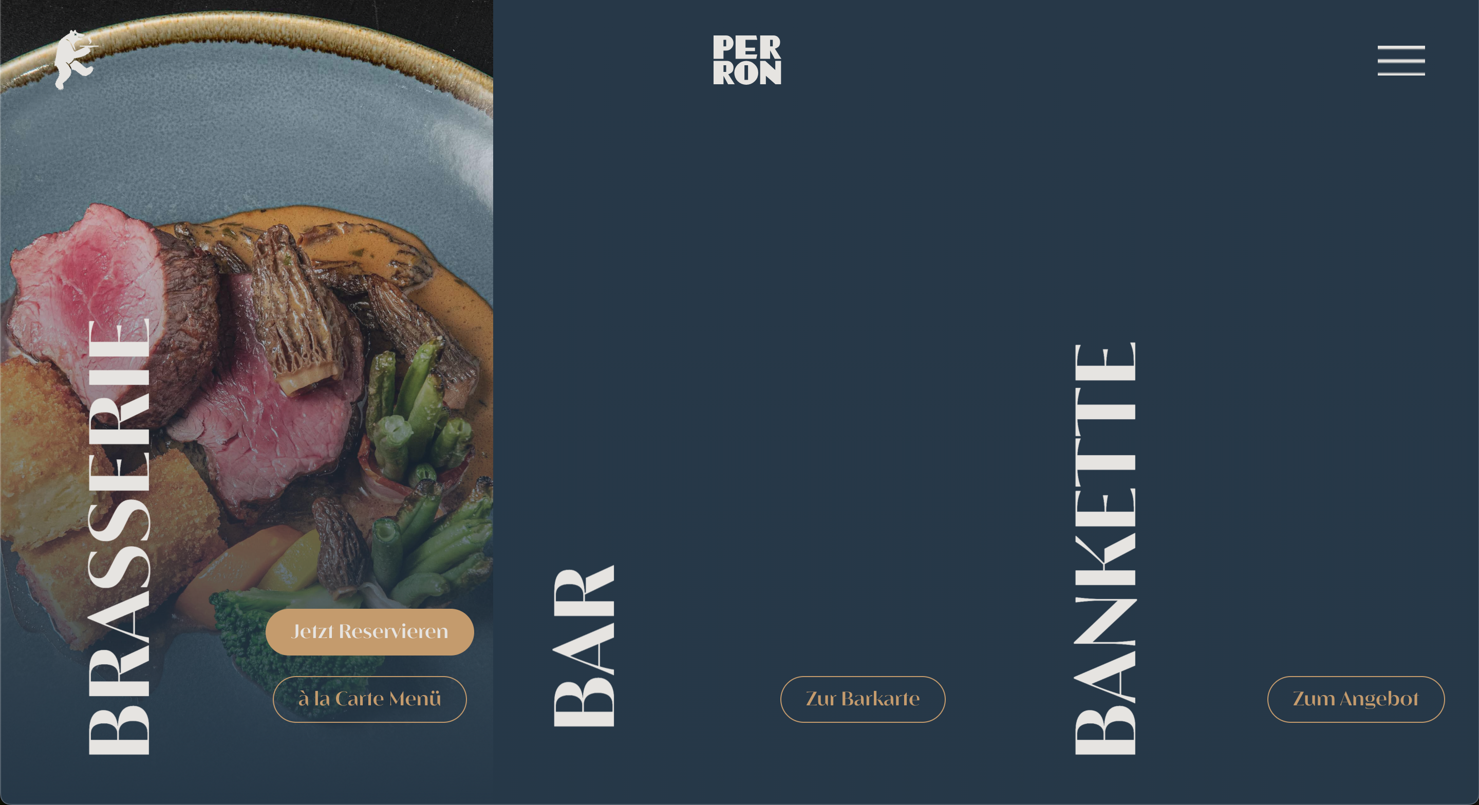
Perron
Beim Projekt für Perron stand Storytelling im Vordergrund.
Das reduzierte Design trifft auf sanfte Animationen und klare Typografie, also genau das, was Scrollytelling ausmacht.
Die Seite führt Nutzer:innen intuitiv durch das Angebot, unterstützt durch dezente Micro-Interactions.
So entsteht ein ruhiges, fokussiertes Nutzungserlebnis, das dennoch emotional wirkt.
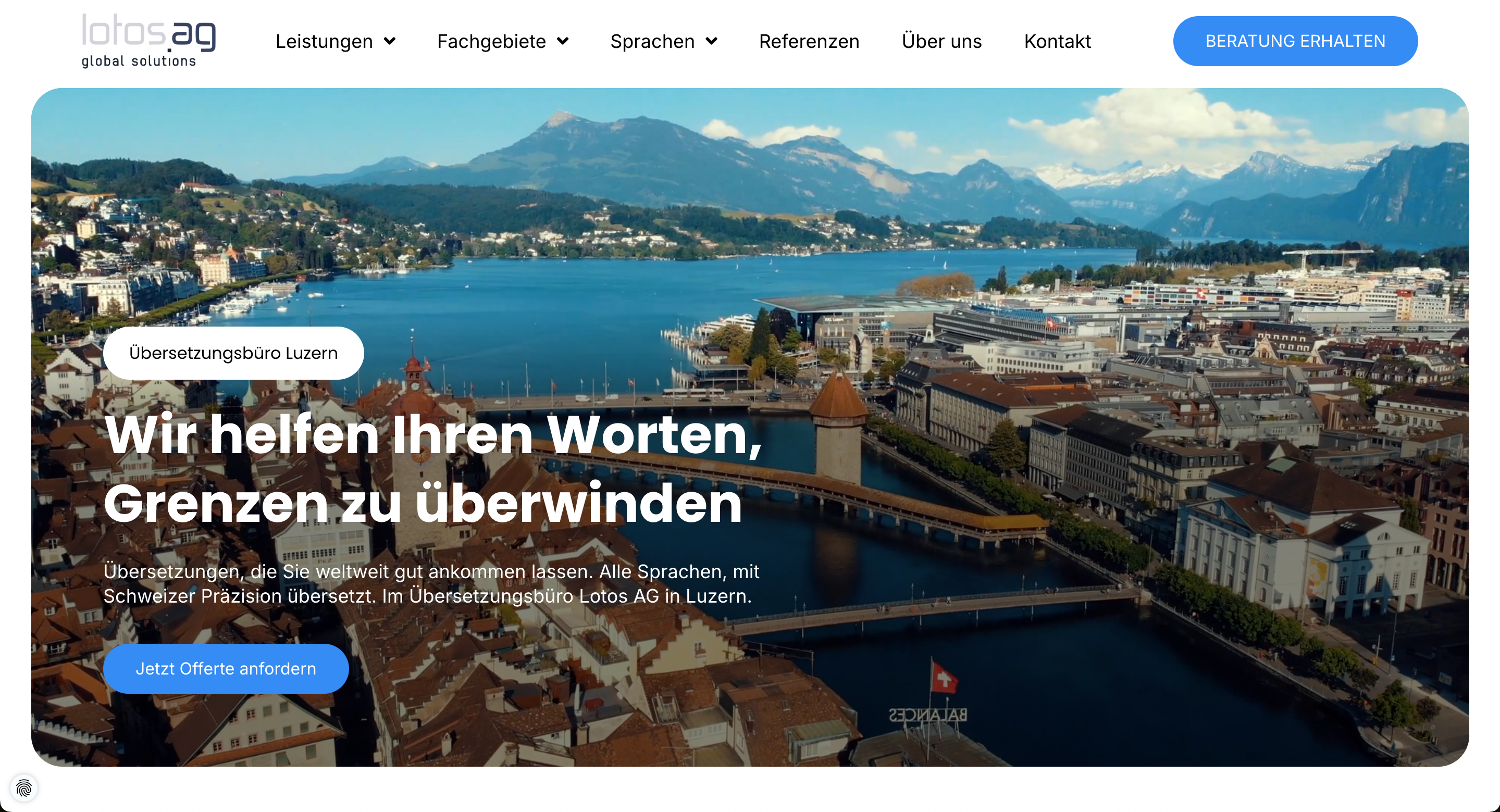
Lotos AG
Lotos AG zeigt, wie sich der Trend zu nachhaltigem Webdesign konkret umsetzen lässt.
Statt auf visuelle Überladung zu setzen, haben wir bewusst mit zurückhaltenden Farben, klaren Strukturen und performanten Ladezeiten gearbeitet.
Die Seite verzichtet auf unnötige Effekte, bleibt dabei aber hochwertig und vertrauenswürdig.
Damit ist sie ein anschauliches Beispiel für digitale Sustainability, das zeigt, wie minimalistisches Design und UX zusammengehen.
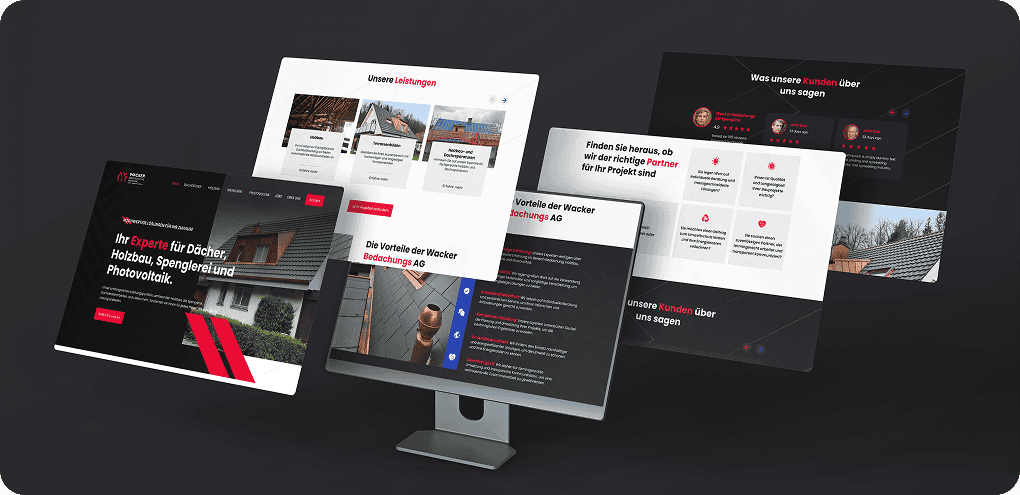
Wacker Bedachungs AG
Für die Wacker Bedachungs AG war klar:
Hier braucht es eine technische, aber dennoch zugängliche Umsetzung.
Wir haben auf eine strukturierte, modulare Gestaltung gesetzt und Elemente aus dem Flat Design mit einzelnen Glassmorphismus-Details kombiniert.
Die Seite wirkt dadurch modern, bleibt aber bodenständig und ist damit ideal für ihre Zielgruppe.
Macher Handel GmbH
Macher Handel ist ein Paradebeispiel dafür, wie Farben und Typografie zum zentralen Gestaltungselement werden können.
Der mutige Einsatz von kontrastreichen Tönen, eine markante Headline-Struktur und gezielte Call-to-Actions greifen mehrere Trends auf:
Bright & Bold, klare Userführung und Conversion-Fokus.
Gleichzeitig zeigen Micro-Interactions und Hover-Effekte, dass eine Website visuell überraschen darf, ohne die Nutzerfreundlichkeit aus den Augen zu verlieren.

Alle diese Beispiele zeigen: Trends funktionieren.
Aber erst durch den richtigen Kontext, eine klare Zielsetzung und das Zusammenspiel mit echten Nutzerbedürfnissen entfalten sie ihr volles Potenzial.
Webdesign-Trends kritisch betrachtet – Hype vs. Mehrwert (USP)
Nicht jeder Trend, der gerade gehypt wird, bringt deiner Website am Ende auch wirklich etwas.
Klar, vieles sieht auf den ersten Blick cool aus.
Animierte Cursors, komplexe 3D-Elemente oder komplett unkonventionelle Navigationen.
Aber die Frage ist:
Wird dadurch etwas besser?
Verstehen Nutzer:innen dein Angebot schneller?
Klicken sie öfter?
Bleiben sie länger auf deiner Seite?
Oft ist die Antwort: nein.
Gerade wenn man den Fokus verliert und sich zu sehr auf visuelle Effekte oder fancy Animationen verlässt, leidet die User-Experience.
Manche Trends machen in einem Design-Wettbewerb vielleicht Eindruck, im Alltag mit echten Nutzer:innen stören sie aber eher.
Zum besseren Verständnis möchte ich dir an dieser Stelle ein Beispiel geben:
Horizontales Scrollen kann spannend sein, funktioniert aber nur, wenn es wirklich gut umgesetzt ist, sonst führt es zu Verwirrung.
Auch extreme Farbverläufe oder wilde Typografie-Kombis ziehen kurz Aufmerksamkeit, wirken aber schnell überladen oder unseriös, besonders in bestimmten Branchen.
Was sich hingegen immer wieder bewährt, sind die unspektakulären Dinge:
- Micro-Interactions, die Orientierung schaffen
- Ladezeiten unter 2 Sekunden
- klare, wiedererkennbare Call-to-Actions
- eine saubere, SEO-freundliche Struktur
- und Inhalte, die nicht nur gut aussehen, sondern auch auf den Punkt bringen, was du anbietest
Diese Dinge sorgen messbar für mehr Conversion, bessere Rankings und eine niedrigere Absprungrate, auch wenn sie nicht so daherkommen wie der neueste visuelle Hype.
Unser Ansatz: Wir feiern Trends nicht um ihrer selbst willen.
Wenn sie UX, SEO oder Conversion verbessern – perfekt.
Wenn nicht, lassen wir es bleiben.
Denn am Ende soll deine Website nicht einfach nur gut aussehen.
Sie soll für dich arbeiten.
Fazit
Webdesign ist im Jahr 2026 vielseitiger denn je.
Von knalligen Farben über interaktive 3D-Modelle bis hin zu KI-gestütztem Design.
Viele dieser Trends bringen echte Chancen: Sie helfen, Inhalte besser zu vermitteln, Nutzer:innen gezielter zu führen und Websites technisch sowie optisch auf ein neues Level zu heben.
Gleichzeitig gilt aber: Nicht alles, was gerade angesagt ist, macht auch Sinn für dein Projekt.
Die Trends, die bleiben, sind oft die unscheinbareren.
Micro-Interactions, klare Navigationen, schnelle Ladezeiten, zugängliche Benutzeroberflächen und smarte Inhalte, die genau dort landen, wo sie gebraucht werden.
Aber was bedeutet das nun und wie weisst du also, welche Webdesign Trends du auswählen solltest?
Frag dich dafür einfach bei jedem Hype:
Unterstützt das meine Ziele?
Passt es zur Zielgruppe?
Ist es umsetzbar – technisch, inhaltlich, wirtschaftlich?
Und bringt es einen echten Mehrwert für Nutzer:innen?
Gerade Entscheider:innen in Unternehmen und Agenturen sollten Trends nicht blind übernehmen, sondern bewusst filtern.
Starke Websites entstehen nicht durch das Kopieren von Buzzwords, sondern durch strategische Entscheidungen, eine klare Botschaft und gutes Handwerk.
Wenn du dabei auf aktuelle Entwicklungen achtest, aber nicht jedem Hype hinterherrennst, bleibt dein Webauftritt auch 2026 stark und relevant.
Und wirkt nicht nur modern, sondern überzeugend.
Häufige Fragen zu Webdesign Trends 2026
Viele Unternehmen, Agenturen und Kreative stehen gerade vor der Frage:
Welche Webdesign Trends 2026 sollte man wirklich ernst nehmen?
Was ist sinnvoll, was ist Spielerei, und wie findet man den richtigen Weg zwischen Innovation, Strategie und Nutzerfreundlichkeit?
Hier beantworten wir die häufigsten Fragen rund um die Trends für 2026, basierend auf unserer Erfahrung mit verschiedenen Projekten und den aktuellen Entwicklungen im Web.
Welche Webdesign-Trends sind dieses Jahr nachhaltig?
Die Trends, die sich langfristig lohnen, sind die, die ein klar messbares Ziel unterstützen, sei es bessere Conversion, ein stärkeres Markenerlebnis oder ein flüssigeres Nutzererlebnis.
Dazu gehören zum Beispiel Micro-Interactions, eine durchdachte User-Experience, schnelle Ladezeiten und die Rückkehr zu klarem, strukturiertem Webdesign.
Auch ein Dark Mode oder gut eingesetzte 3D-Elemente sowie minimalistische Layouts mit viel Weissraum funktionieren 2026 (und darüber hinaus!) sehr gut.
Und das nicht, weil sie „neu“ sind, sondern weil sie für Fokus und Klarheit beim User sorgen.
Spannend wird es auch, wenn du gezielt KI-gestützte Design-Tools einsetzt, um schneller zu iterieren, mehr Varianten zu testen und deine Benutzeroberflächen datenbasiert zu optimieren.
Wie stark beeinflusst KI das Webdesign?
Künstliche Intelligenz verändert, wie wir denken, planen und gestalten – das betrifft auch das Webdesign.
Aber es verändert nicht, was gutes Design ausmacht.
KI-Tools wie Framer AI, Uizard oder Relume übernehmen heute Aufgaben wie Layout-Generierung, Bildvorschläge oder sogar erste Content-Ideen.
Das spart Zeit und eröffnet neue Wege, gerade in der frühen Phase der Gestaltung.
Aber: Stand 2026 ersetzt KI keine Designer:innen.
Sie ist mehr ein Tool, das den Designprozess beschleunigt und erleichtert.
Es braucht aber weiterhin Web- und UX-Designer, welche die KI-Vorschläge evaluieren und entscheiden, was sinnvoll ist und was nicht.
Gerade bei Barrierefreiheit, Markenführung oder emotionalem Design bleibt die menschliche Perspektive entscheidend.
Das grösste Potenzial liegt aktuell in der Kombination aus Automatisierung von operativen Designaufgaben und Strategie. Das führt zu weniger wiederholbare Aufgaben und damit mehr Raum für konzeptionelles Denken.
Was ist wichtiger: visuelles Design oder Usability?
Die Antwort ist ganz klar: Beides.
Aber wenn du dich entscheiden müsstest – immer Usability.
Ein wunderschönes Webdesign, das Nutzer:innen verwirrt, verfehlt sein Ziel.
Und eine funktionale, aber visuell unattraktive Website bleibt oft nicht lange im Gedächtnis.
Es kommt also mehr denn je auf das Zusammenspiel an: ein Design, das Orientierung gibt, Inhalte verständlich aufbereitet und dabei trotzdem deine Marke ins richtige Licht rückt.
Visuelles Design schafft den ersten Eindruck.
Benutzerfreundlichkeit sorgt dafür, dass Menschen bleiben und wiederkommen.
Wenn du beide Komponenten gezielt kombinierst, entsteht ein digitales Erlebnis, das funktioniert und begeistert.
Mein Tipp: Denk in Strategien, nicht in Trends.
Nutze aktuelle Entwicklungen als Inspiration, aber passe sie so an, dass sie zu deinen Inhalten, deinem Publikum und deinem Thema passen.
Denn am Ende entscheidet nicht der Hype, sondern der Mensch vor dem Bildschirm.

